Exclusive | Synara: A fragrance concept that wears emotion like armour
In this interview, we explore the creative vision behind ByAllMeans Studio’s latest perfume concept, Synara, and the artistic process that gave it its unique character. This bold bottle combines modern design with storytelling to capture a strong and multi-dimensional sense of femininity. With its striking shape and careful details, Synara is a powerful symbol where strength and softness come together, encouraging every woman to show all sides of herself.
Tell us a bit about the brand – its heritage, its story, and its markets.
Synara is a new niche perfume concept, designed for global audiences. The idea came out of conversations about femininity—how versatile, layered, and deeply personal it is. We spoke about how many women feel and express themselves differently depending on the moment, and how scent can be a powerful emotional tool in that process.
Synara is an ode to the complex and often contradicting nature of the female spirit. It’s a tribute to the duality within every woman: delicate yet unbreakable, graceful yet powerful. A fearless warrior and a poetic soul—coexisting seamlessly. We wanted to celebrate that paradox in a way that felt honest and visceral.
Perfume is incredibly personal. Women wear fragrances to feel a certain way—soft, bold, romantic, daring—and those moods can shift with the day, the season, the situation. Scent is one of the strongest memory triggers; it can instantly transport you into a moment, a feeling, even a physical sensation. We started to think: what if this could work in reverse? What if scent could be used not only to preserve memory but to activate specific emotions on demand?
That became the heart of Synara, creating a brand that empowers women to shift between different facets of themselves, fully and unapologetically. One scent to bring up soft and romantic side, another to feel powerful and fearless. We wanted to create a brand of fragrances that covers an array of strong female characters and vibes needed to fiercely grab what this they want from life and embrace it.
How does the design express the brand’s values? What inspired the design?
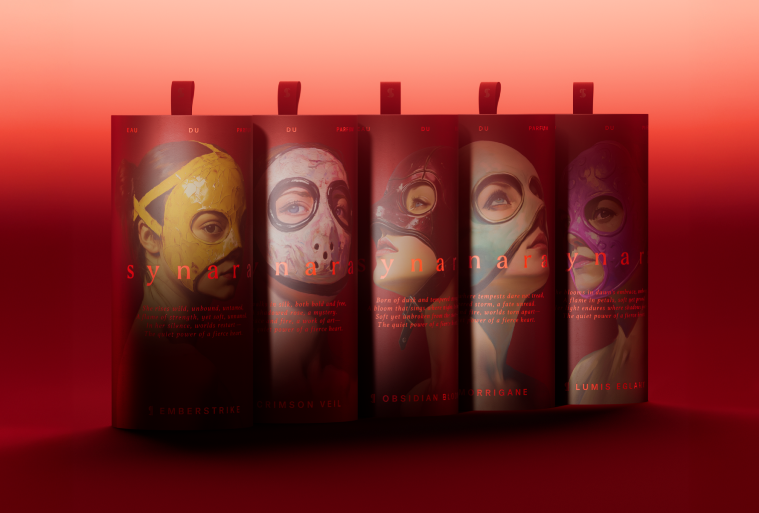
At the centre of the brand are five distinct characters—each one capturing a different facet of this tension between strength and softness. Wearing nothing but fighter masks, they stand unapologetically, each accompanied by minimal typography and poetic lines that tell their story. Every description ends with the signature phrase:
“The quiet power of a fierce heart.”
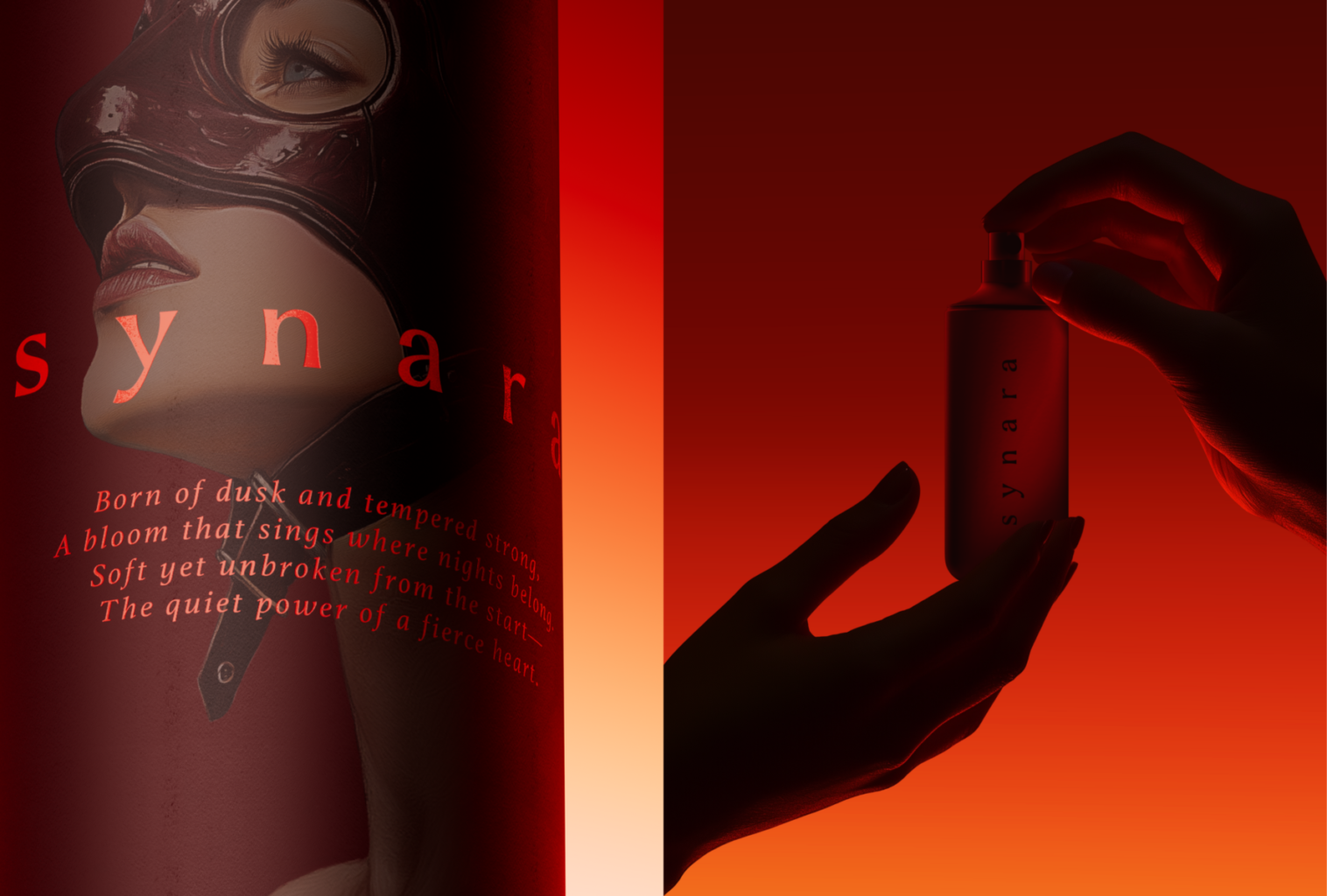
The visual metaphor of a fragile woman in a fighter mask worn like an accessory felt immediate and strong. It was brave, memorable, and felt like something new for the niche fragrance world—where so much tends to be minimal, abstract or ingredient-led. This felt like a clear, emotional visual that anchored the brand from the start.
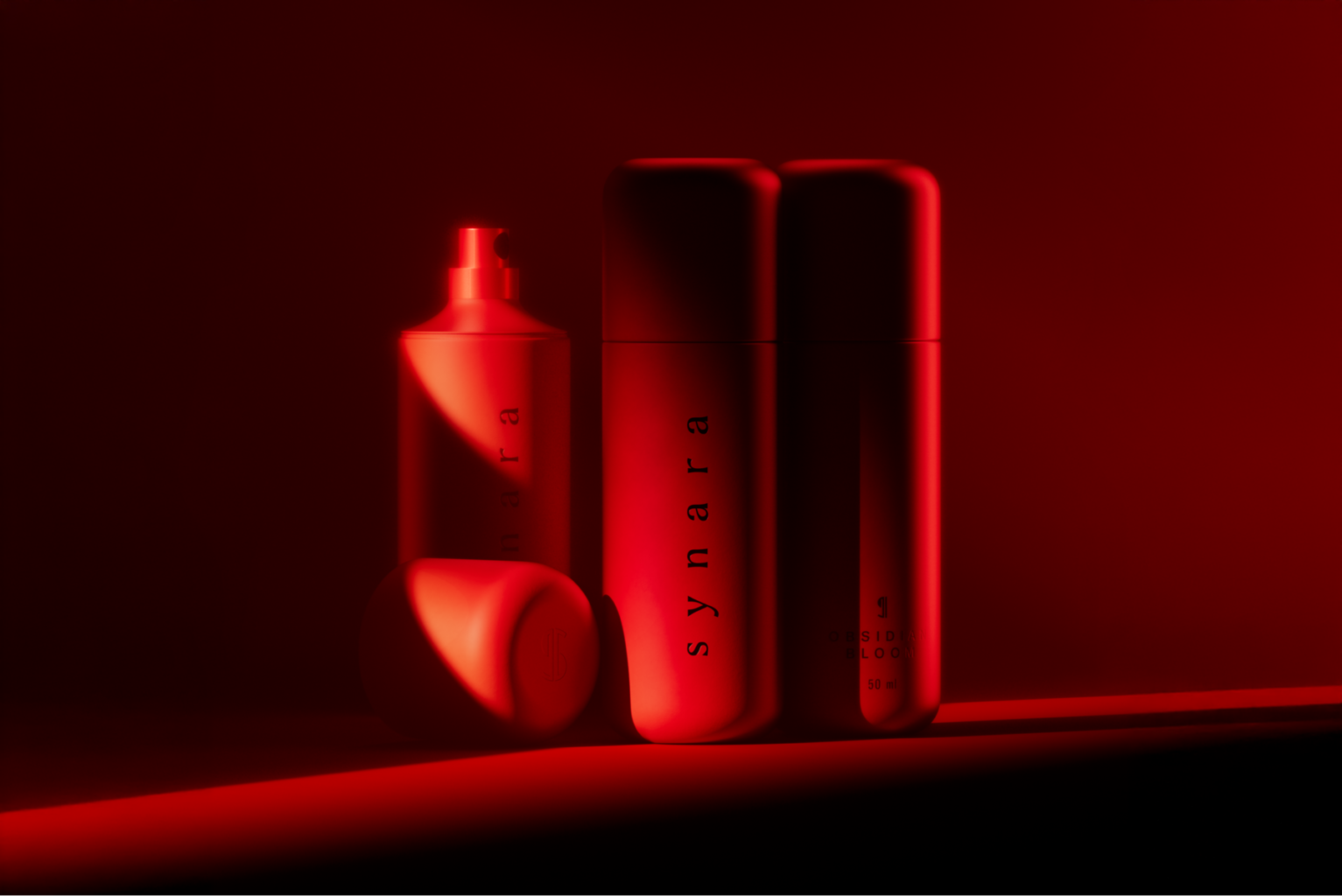
The identity uses the paragraph symbol (¶) as a storytelling device. It represents that women write their own stories—through their emotions, their choices, their character, and even the perfumes they wear. Two paragraph symbols combine into an “S”—the Synara emblem—a symbol of strength expressed through subtlety.
This idea continues through the packaging. The bottle is a sleek, red bullet-like form, standing tall on a textured hexagonal base—a nod to a fighter standing in the ring. It’s sharp, elegant, and built to make a statement without excess.
Each fragrance name reflects a poetic yet punchy energy:
Emberstrike – Fire and resilience in a single breath.
Lumis Églant – Light and thorns, grace with a bite.
Obsidian Bloom – A flower forged in the dark.
Crimson Veil – Beauty wrapped in mystery, laced with strength.
Morrigane – The spirit of battle, fierce and untamed.
Synara isn’t about a cliché version of empowerment. It’s about truth, about showing that strength and softness aren’t opposites, but two sides of the same force. This is a perfume for women who own their contradictions and wear them boldly.
What is innovative or unusual about your packaging?
I think it’s the visual directness that stands out—especially in the niche fragrance space, where minimalism, black-and-white palettes, and quiet abstraction tend to dominate. Most niche perfume brands avoid storytelling through character and focus on ingredients or mood. That’s valid, of course, but we wanted to break that pattern.
Synara brings the character front and centre. It doesn’t shy away from emotion or symbolism. That choice felt natural given the theme—but it also makes it stand apart. And that works well with the brand’s essence: showing another side of femininity, confidently and unapologetically.
What technical challenges did you need to overcome to manufacture the packaging, if any?
At this stage, Synara is still a concept, it hasn’t gone into production yet. But we put a lot of effort into building the visual universe. We used a variety of mediums and tools from hand sketching to 3D design to AI to bring the idea to life. It’s an exciting time to be working creatively with all these tools.
What reactions have you had from customers?
We’ve had a really strong, emotional response. People seemed to connect with the concept immediately. They appreciated the depth and the storytelling—it resonated. Within the design community, it’s been very well received, and it has also sparked interest from clients in the beauty and fragrance industries. We’re humbled and excited by the reaction, and we’d love to collaborate with a fragrance house to bring Synara into the real world and put it on shelves.