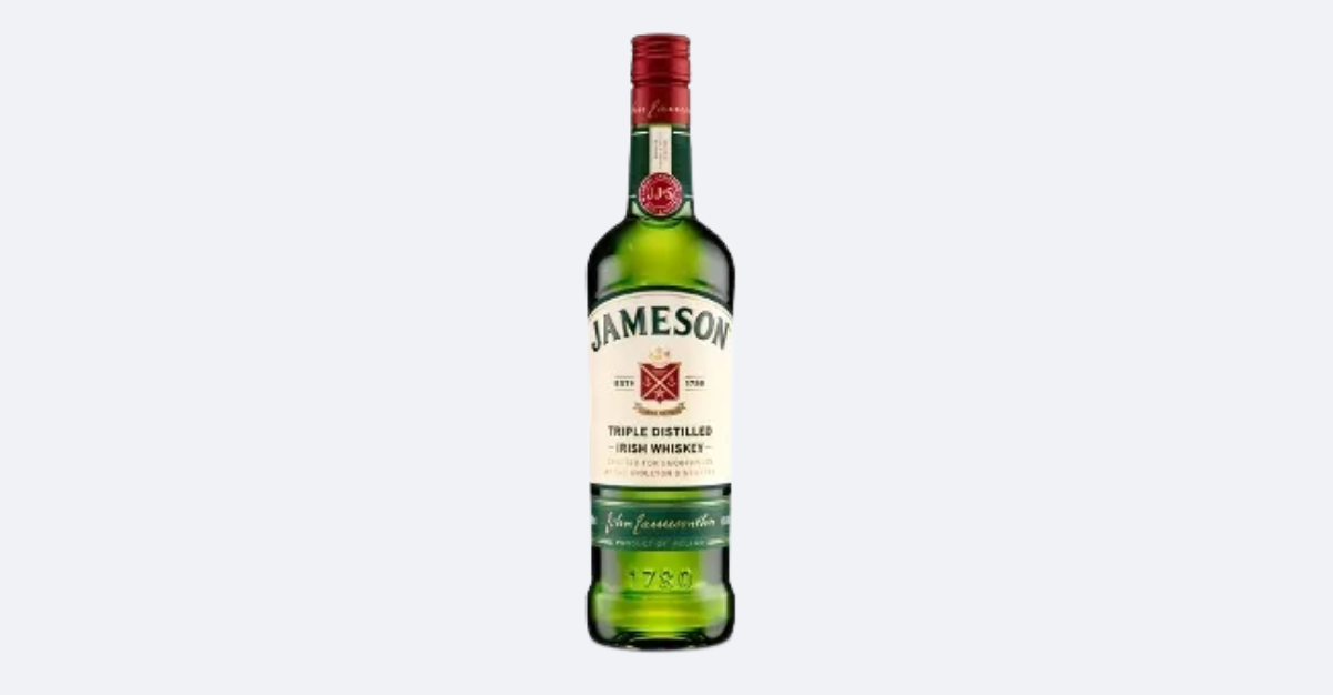
Jameson unveils a new evolution of its iconic bottle
The Irish brand is subtly modernising its design while reaffirming its heritage, expertise and roots in Midleton.
Since 1968, Jameson’s green silhouette has remained virtually unchanged, a symbol of its global success. The new version highlights its hometown, Midleton, with the words ‘Crafted for Smoothness at the Midleton Distillery,’ a direct tribute to the place where the magic happens.
The redesign introduces brighter colours, a modernised logo and details such as embossing and aluminium foil. These additions reinforce the premium feel and ensure greater shelf presence, while preserving Jameson’s iconic DNA.