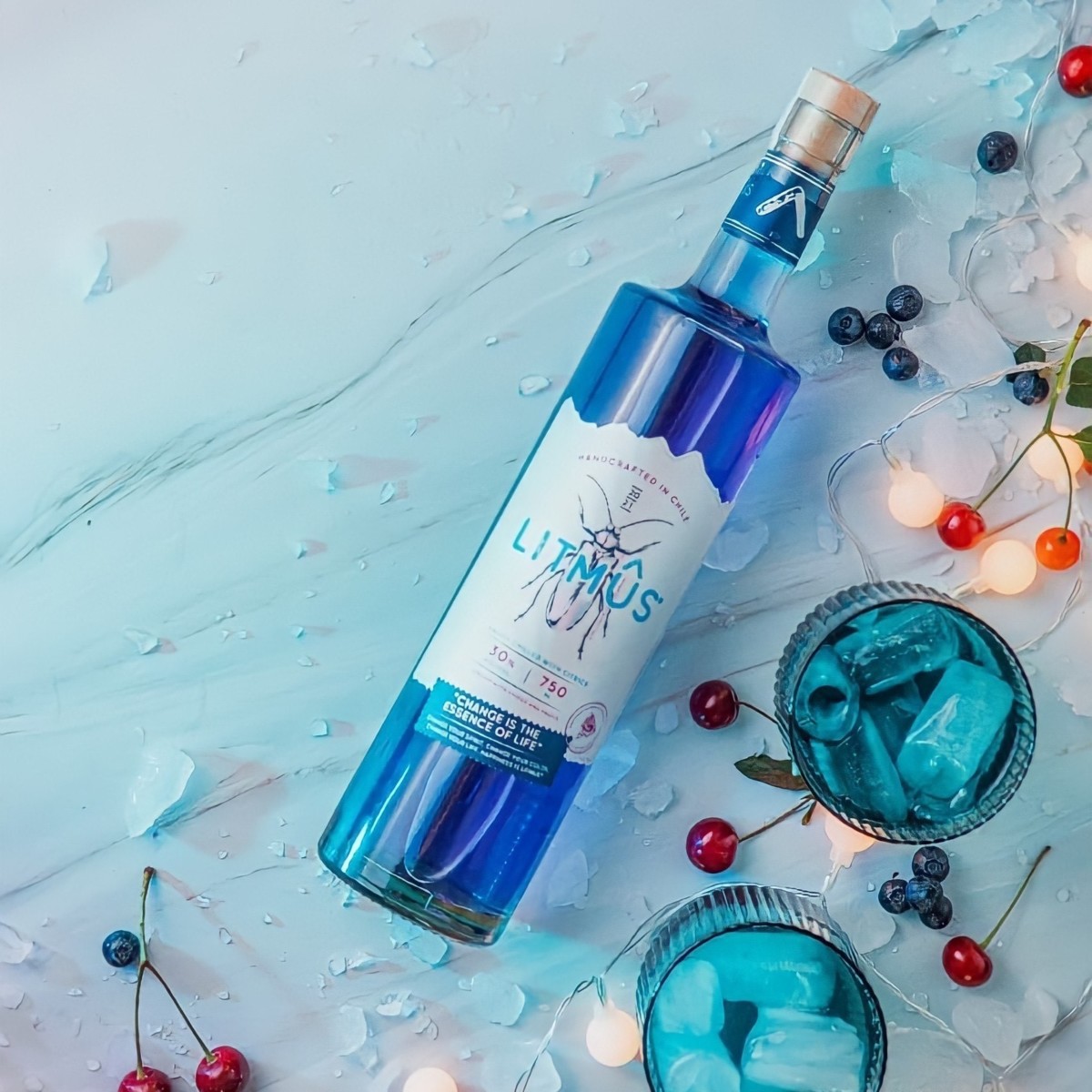
In an industry that was very affected by the pandemic; each one of the founders of Litmus liquor looked into the future and decided to turn this economic uncertainty around.
According to the founders, “We approached Giorgio Pandolffo, a graphic designer with extensive experience in packaging, to articulate and give life to the product. Our references were the South of Chile (Licanray, where the project started),change (colour, social outbreak and pandemic) and forest conservation (generate the least impact on the environment). At that moment, we decided that we were going to need a strong image, easy to remember and able to bring together all the referential concepts”.
After several brainstorming processes, the founders concluded that the image would be the “Luma Chilena”, an endangered beetle that calls its mate through its iridescent colours. This is the origin of the word “LITMUS”. To make the label even closer to their country, we decided that the die would resemble the Andes Mountains.
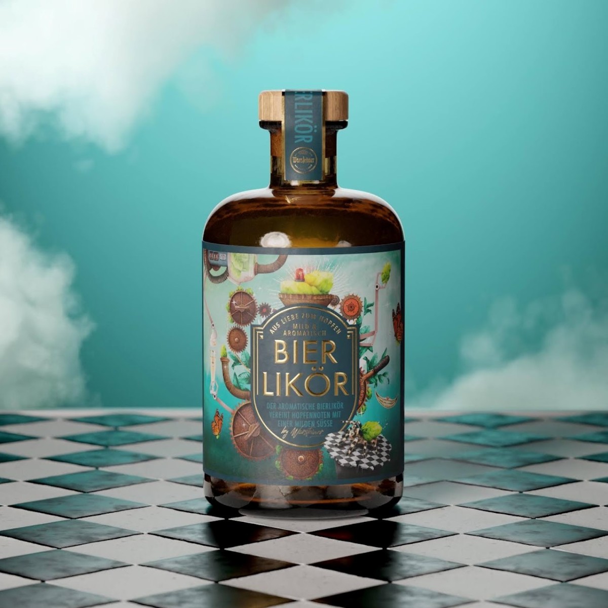
To celebrate New Beer’s Eve we shared this design by WIN Creating for Wasteiner!
Between Alice in Wonderland and Charlie and the Chocolate Factory: Warsteiner creates a bizarre dream world for its beer liqueur, therefore Win Creating Images implemented the “somewhat different” design for their existing customers.
According to the designers, “The task was to create a bold, completely different packaging and to take a completely free approach. Of course, we are on fire and can really let our love of design come into play. We are always happy when clients dare to take this step with us,“ says Luc Buetz, Managing Director of WIN Creating Images”.
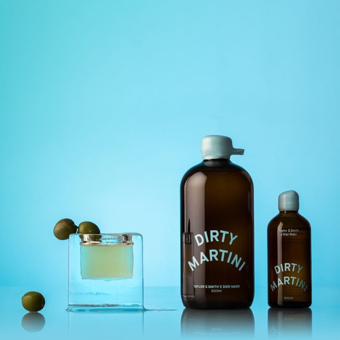
Taylor and Smith Distilling launched a sub-brand collaborative cocktail range with local cocktail slingers Dier Makr in lockdown to provide an easy to drink product alternative and a much-needed awareness and sales boost for Taylor & Smith Distilling Co.
According to the designers, “The familiar round typographic brandmark is shaken up in a playful, cocktail appropriate way. We retain key brand characteristics of the bold palette and coloured glass along with handmade qualities of waxed lids and rotary screen-printed branding”.
The artisan quality of the spirits is emphasised through playful typography, art direction and beautifully sculptured ice in an eye-catching social media campaign, embodying the Taylor & Smith Distilling Co. brand narrative of Tasmanian landscape distilled through an artisanal lens.
JDO Global continues to support its long-standing partners at Pernod Ricard with The Glenlivet 12YO Licensed Dram design. This new limited edition marks the second chapter of The Glenlivet’s ‘Original Stories’ series and follows the widely popular ‘Illicit Still’ launch, also designed by JDO.
The outer packaging features the original 1824 license, distressed by time, with the hand-stamped brandmark and other elements deliberately asked to create a slightly edgy and contemporary feel. This document is also showcased on the bottle label with gold accents on The Glenlivet’s smooth-flowing curve to highlight the premium proposition of this limited edition. The unique bottle shape is inspired by the oldest The Glenlivet structure and is used, along with the deep teal colour, by all offerings in The Glenlivet’s ‘Original Stories’ collection.
Keeping in line with The Glenlivet’s ‘Original by Tradition’ philosophy, JDO’s design celebrates this pivotal moment in whisky history in a way that feels modern, elevated, and authentic.