

Exclusive | The Glenrothes 51: Crafting a packaging experience for a rare Whisky
In this interview, we speak with Jamie Hale from Zone Creations and Mark Gordon from Studio Form Design Agency, the creative minds behind the development of The Glenrothes 51 presentation piece. Working collaboratively, they brought together design, engineering, materials and manufacturing to transform an ambitious concept into a highly crafted physical object.
The Glenrothes 51 is an exceptionally rare whisky, with just 102 pieces produced. Rather than following traditional luxury packaging conventions, the project takes a deliberately unexpected approach, creating an object that is designed to be broken in order to reveal what lies inside.
From the substantial, architectural quality of the Jesmonite exterior to the kintsugi-inspired repair process that gives the packaging a second life, Jamie and Mark reveal how the team turned the act of opening the pack into an integral part of the experience.

Can you tell us more about Zone Creations, its story, values, and how your collaboration on The Glenrothes 51 began
Zone Creations specialises in the development and production of highly crafted, technically challenging packaging and presentation pieces, often working at the point where design, engineering, materials and manufacturing meet.
The Glenrothes 51 was very much that kind of project. We worked collaboratively with Studio Form to take the packaging concept from design into a physical object that could actually be produced, while retaining the level of detail and finish expected of an exceptionally rare whisky.
From the outset, it was less a conventional designer-and-supplier relationship and much more of a collaborative development process. The ambition for the piece required constant dialogue between creative intent, material behaviour and manufacturing reality.
What do you feel is most unusual or innovative about the packaging?
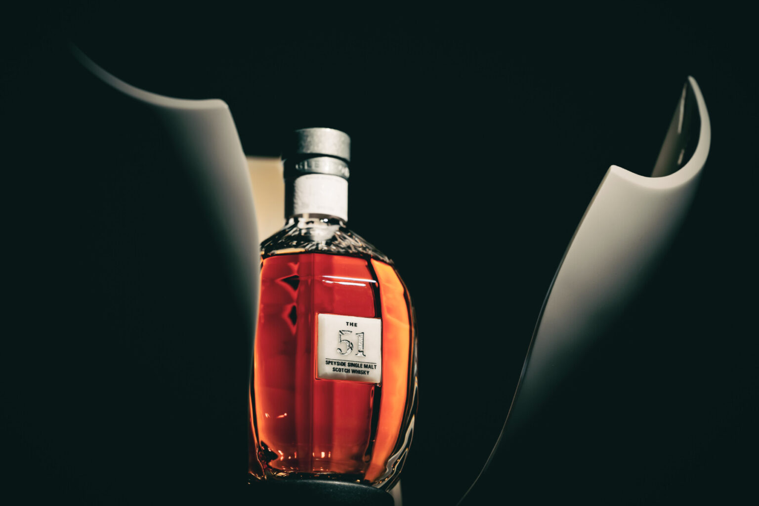
The most unusual aspect is the way the outer presentation piece was conceived almost as a sculptural object rather than conventional luxury packaging.
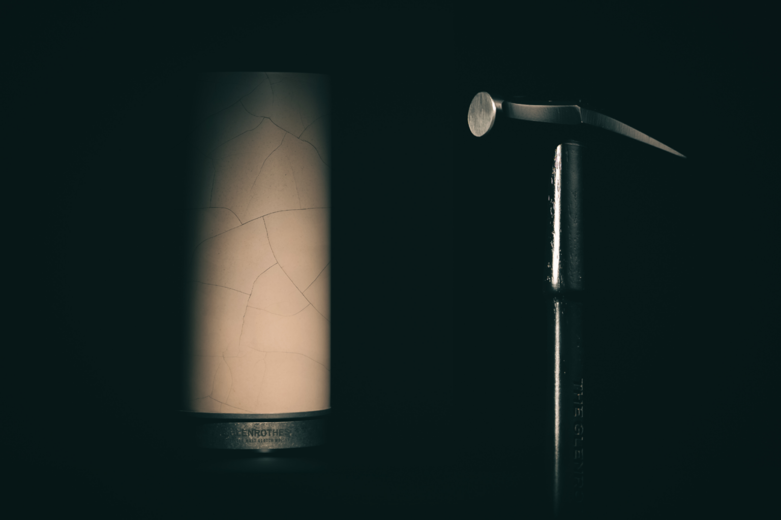
Produced in Jesmonite, it was deliberately designed to be broken in order to access the whisky inside. The fractured pieces could then be repaired using a process inspired by the Japanese art of kintsugi, turning the act of opening the packaging into part of the story of the object itself.
Rather than using decoration simply as a surface treatment, the concept was embedded into the physical construction and the experience of opening it. Breaking something so carefully made in order to reveal what is inside creates a moment of tension, but it also means the packaging changes through that interaction. Once repaired, it carries a physical record of having been opened.
The Jesmonite gives the piece a substantial, almost architectural quality, while the gold repair detailing creates a striking contrast against its raw, mineral surface.
With only 102 pieces produced, we wanted each one to feel closer to a crafted, collectible object than a traditional presentation box.
Were there any challenges during the creative process, whether strategic, visual, or technical, and how did you approach them?
One of the biggest challenges was inherent in the idea itself: we were creating a highly crafted piece of luxury packaging that the owner would ultimately be asked to break.
That sounds simple conceptually, but technically it created a number of questions. The Jesmonite needed to feel substantial and permanent, while also behaving in the intended way when the moment came to access the bottle. We had to consider the construction, material thicknesses, tolerances, protection of the bottle and how the entire opening experience would work.
There was also a psychological challenge. Luxury packaging is normally designed to remain pristine, so deliberately asking someone to damage it goes against almost every convention within the category. That tension became an important part of the experience rather than something we tried to remove.
The subsequent kintsugi-inspired repair was equally important. It gave the act of breaking the piece a purpose. The packaging wasn’t simply destroyed and discarded. It could be reconstructed, with the gold repair becoming a permanent record of that moment.
Getting all of those elements to work together required close collaboration between design and manufacture, with prototyping and refinement playing a major part in translating the original idea into the finished object.
From your perspective, what role does packaging play in creating desirability and emotional value around luxury drinks?
For something as rare as The Glenrothes 51, packaging has to do much more than protect and present the bottle. It should contribute to the experience and give the owner something they remember.
At the highest end of luxury, simply making something more ornate or using increasingly expensive materials isn’t necessarily enough. What creates emotional value is often the experience around the object: its weight, texture, how it opens, what you discover and the sense of anticipation before you actually reach the whisky.
With The Glenrothes 51, we deliberately introduced a moment that feels almost wrong. You have this beautifully yet almost boring object in front of you and, to access the whisky and the beautiful internal sculpted design, you have to break it.
That creates an emotional response which a conventional lid or presentation box simply can’t replicate. The subsequent repair then gives the packaging another life. It becomes a record of the experience rather than something that has simply performed its function and can be discarded.
For me, that’s where luxury packaging becomes particularly interesting. It isn’t necessarily about excess. It’s about creating meaning, ritual and an experience worthy of the product inside.
How has the feedback been so far, from the client, consumers, or even the design community?
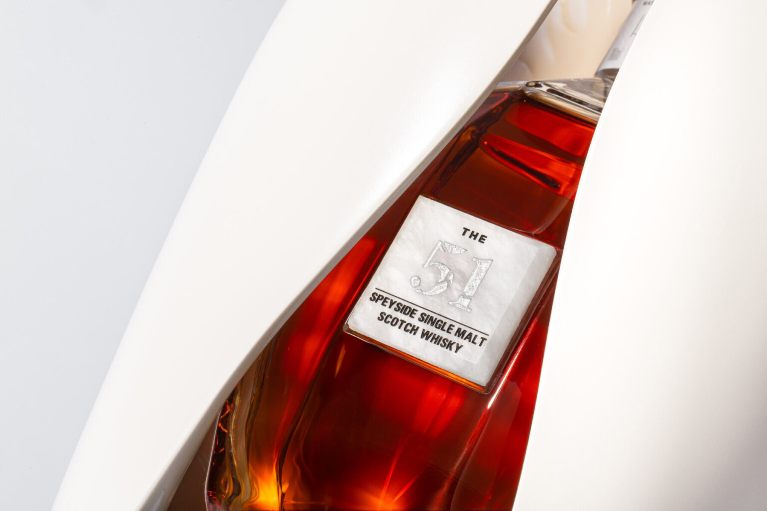
The response has been incredibly positive, both to the finished piece and to the thinking behind it.
What has been particularly satisfying is that people don’t seem to view it simply as packaging. They engage with it as an object and are fascinated by the idea that something so carefully made is deliberately designed to be broken.
The project has also received significant recognition from the design community, particularly for its combination of concept, materiality and craft. It has gone on to win a number of major industry awards, including recognition at the Paris Packaging Week – Formes de Luxe Awards, The Dieline Awards, and the Scottish Design Awards for Packaging. For us, that recognition is particularly rewarding because the project was judged not simply on how it looked, but on the strength of the idea, the experience and the craft behind its execution.
Beyond the design world, The Glenrothes 51 has attracted international attention from publications including Bloomberg, Forbes and Robb Report. For a release limited to just 102 examples, seeing the project and its story travel so widely has been hugely rewarding.
Ultimately, though, I think the strongest reaction is the simplest one: people want to touch it, understand how it works and know why they are being asked to break it. That curiosity and slight sense of apprehension is exactly what we hoped the packaging would create.
Design & development: ZONE CREATIONS x STUDIO FORM DESIGN AGENCY
Jamie Hale, Zone Creations
Mark Gordon, Studio Form Design Agency
Share this article


Photo de www.industries-cosmetiques.fr
Subscribe to our newsletter
The latest articles from Paris Packaging Week