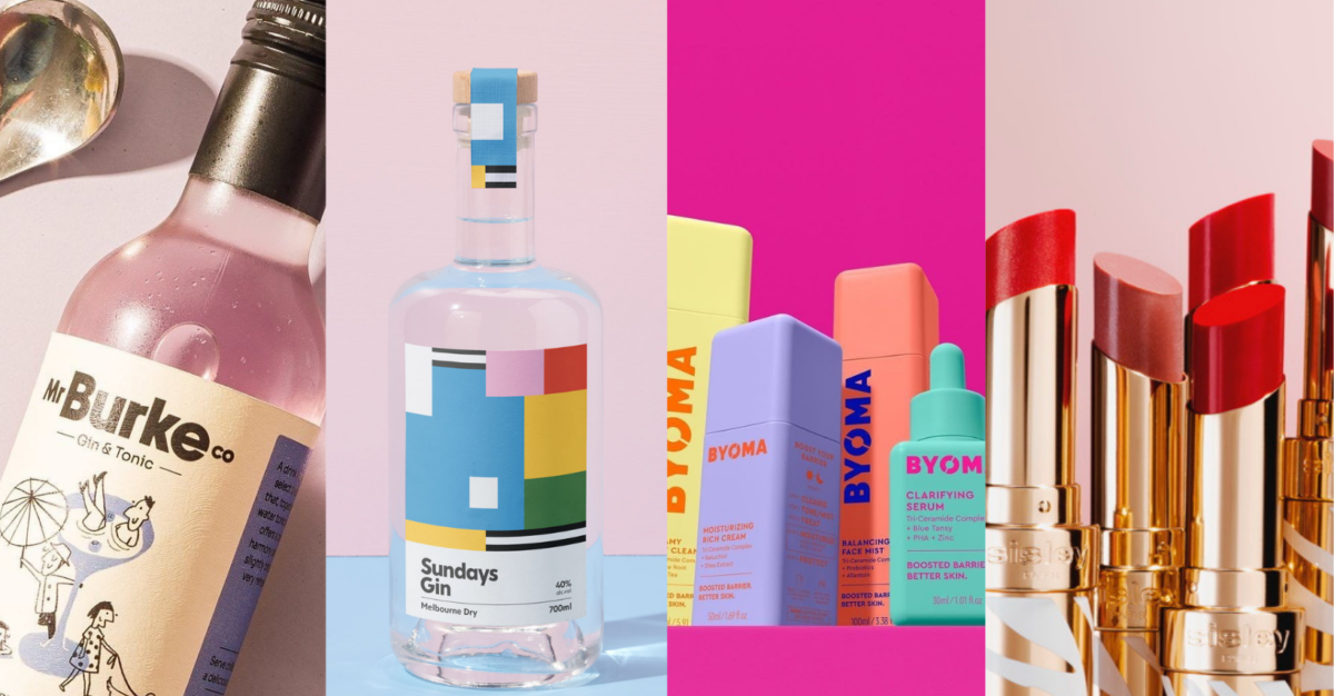
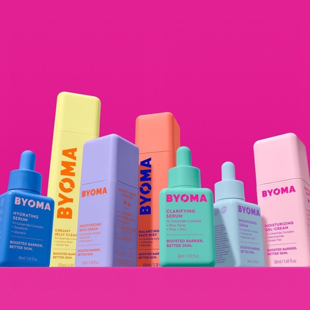
BYOMA is a skincare brand which provides everyone with the building blocks to better skin, thanks to luxury ingredients at an accessible price point.
According to the design director, “BYOMA is a bold, innovative, and colourful brand on a mission to shake up the world of skincare. To represent this visually, we worked to create sleek, joyful, and distinctive packaging with standout shelf presence that makes you want to find out more about the pioneering products”.
The split device of the ‘O’ in the brand’s logo is a nod to the brand’s mission of breaking beauty barriers with breakthrough formulas, while the modern typography and iconography lends itself beautifully to displaying the brand’s science, ingredients, and innovation.
TNT Global Manufacturing has designed the stunning Phyto-Rouge Shine lipstick for Sisley!
TNT Global Manufacturing designed the lipsticks in gold anodized aluminium with a PP insert and decorated with a white silkscreened pattern, protected by a varnish.
A silkscreened S on the top and the debossed logo mark this rechargeable pack.

Founded from the idea of bringing people together, Sundays Distilling came about from wanting to create and bottle spontaneity of all those great Sundays well-spent with great friends.
The owner’s motivation was to take the unknown around gin and produce a lively spirit without all the fuss; something that’s easy to mix, with a softer taste so you can appreciate for a few rounds.
Wiltshire Creative designed a bold, fun and sophisticated pack creating an overall look that feels playful yet confident at the same time.

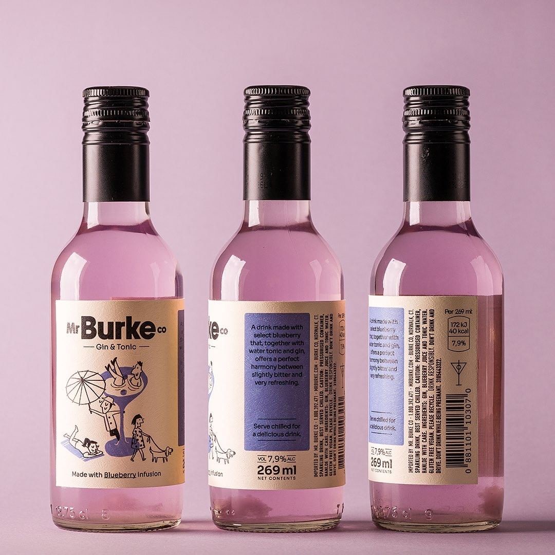
Mr Burke Co is a Gin & Tonic ready to drink brand created to differentiate itself from other products in the beverage sector.
The texture of the label makes the photograph shine, giving the feeling that it was handcrafted, light and smooth. Without pretending to be expensive, automated, or lacking in personality.
According to Pns design, “I decided to break one of the main unwritten rules in the packaging world: that the main information must be in the central region of the label. In this case, Mr Burke reinforces the concept of the anti-hero used in the manifesto. Therefore, we reduced the size of the artwork so that it had a good unlabeled leftover between one side and the other”.