CURIUS is a new drinks producer launched to disrupt how drinks brands are created, managed, marketed and distributed across global markets by focusing on three key pillars – Brand, Courage, and Swiftness.
The brand designed MATCH, which symbolises the catalyst for change in the soft drinks industry.
The pack embraces sustainability through the use of 100% post recycled glass, and by tackling logistical efficiency with its squared format.

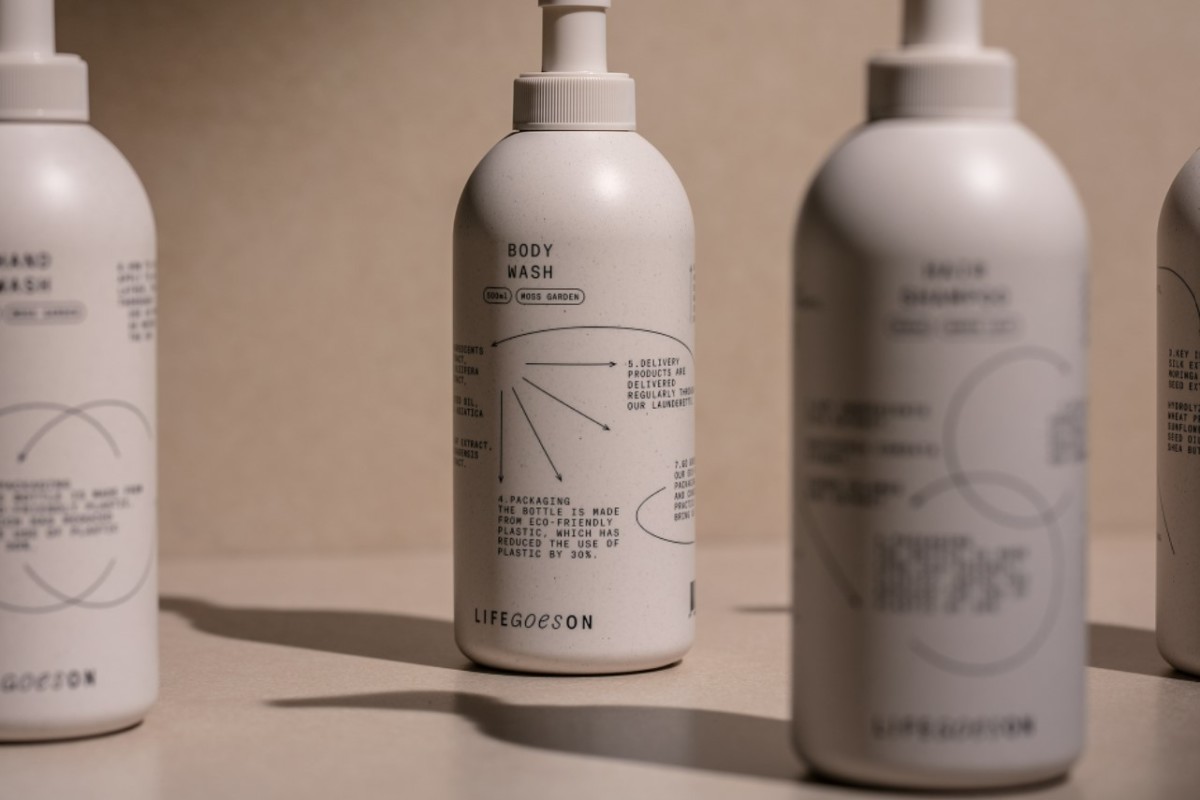
CFC has developed the brand identity and package design system of LIFE GOES ON, a life amenity brand launched by LAUNDRYGO.
The bottles are made from eco-friendly plastic which has reduced the use of plastic by 30%.
LIFE GOES ON also reduces packaging and shipping costs by shipping everyday items such as body wash, shampoo, toothpaste, and towels together with laundry in a wheeled cabinet. When a consumer rinses the used containers and places them in the wheeled cabinet, LAUNDRYGO collects them and delivers them directly to a recycling company.
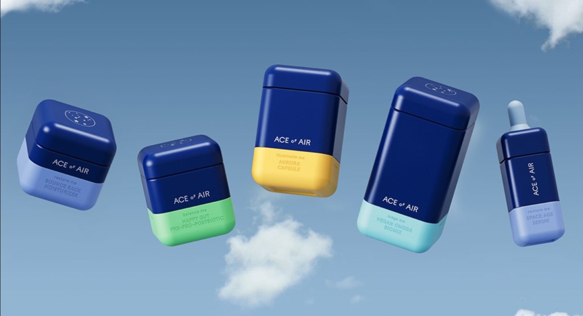
Ace of Air is the first entirely circular beauty and wellness brand.
According to the designers at Barlett Brands, “We built it from the ground up—innovating and reinventing everything to create an entirely new playbook for a waste-free world”.
From meticulously designing zero-waste refilled packaging to hiring a circus instead of professional models, the brand broke barriers to create an uplifting brand that puts people and planet above all.
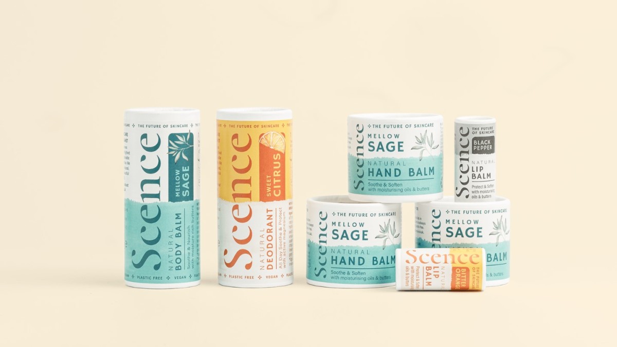
Scence called on Kingdom & Sparrow with a mission to grow its all-natural, completely sustainable skincare brand.
According to Kingdom & Sparrow, “To move them away from their more artisan identity, we developed a fresh look that brought them into the modern, commercial skincare market. We developed a strong identity with more ownable flourishes and contemporary design that identified with their consumer. We chose a mature colour palette and hand-painted illustrations to reflect the natural ingredients and add a premium touch”.