Tell us a bit about the brand – its heritage, its story, and its markets – and the brief for this project. How does the design express the brand’s values?
Craster is a quaint town on the English coast of Northumbria with a long lineage of fishing tradition. The Craster’s Rest gin began life from local fishermen in the area who brewed their own gin to bring them a bit of ‘dutch courage’ when facing the infamous and incredibly dangerous North Seas. The name ‘The Craster’s Rest’ represents the relief the men would have when they returned home, and according to the old sailor fable, when the town welcome the men home safe, it would put the town to rest.

What is unusual or innovative about this pack?
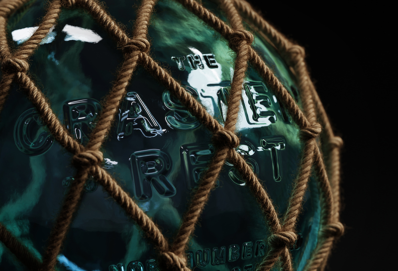
The craft Gin market, especially in the UK, is extremely competitive. There are new craft gin assigned to almost every town and city and in some cases even roads in London. So we wanted to create a bottle and packaging design that was unexpected and disrupted the market. The story of the gin is an interesting one, it’s an old fishing towns recipe that the fishermen used to drink before they headed out to sea. This evoked a lot of rich visuals but the one thing that stood out to us was the old glass fishing buoys used in the early 1900’s. Studio Unbound decided these lovely objects had to be the basis for our design.
So they set out with the task to make these bottles look as close to those fishing buoys as possible.

What technical challenges did you have to overcome to manufacture this pack?
There were quite a few challenges but the biggest was getting the rope to wrap around the bottle like it does. The designers had to think about how the knots were going to lay on top of the glass as well as the best way to tie these off neatly at the top and bottom of the bottle. After 100’s of sketches, they enlisted the help of a 3D modeler to bring this to life.
The other challenge was marrying up the different materials so they all sang together without competing. They had the texture of the blown glass, the rope, the PVC fisherman’s coat neck label, but the cap took the longest to get right, a last minute swap for weathered wood instead of cork really brought the materials together.
What reactions have you had from your consumers?
“The response so far has been outstanding, it has really caught peoples eye but more so their imaginations. This is further proof that our motto, ‘The art of the unexpected’, really works”.

Martyn Garrod, Founder of Unbound Studio
Connect with Martyn :