Design case study | Team Dr Joseph – an Italian skincare brand

Team Dr Joseph is a line of premium skincare based and handmade in Italy. Its main focus is to combine nature and advanced technology. The range is vegan, natural, skin-friendly, and rich in effective biotechnological ingredients. To develop a premium packaging system that reflects the quality of the contents, Team Dr Joseph worked with design agency Headless Horse to fulfil their brief.

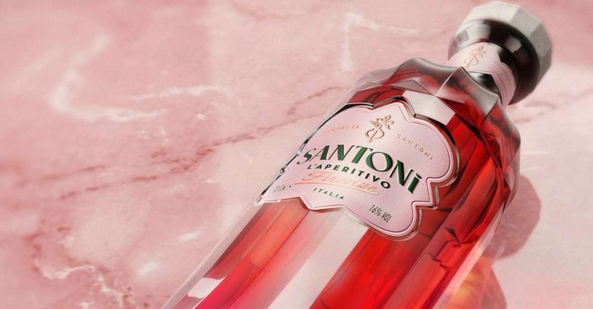
Tell us a bit about the brand – its heritage, its story, and its markets – and the brief for this project. How does the design express the brand’s values? What inspired the design? 

Team Dr Joseph is a line of sustainable and natural skincare, founded and handmade in Italy, since 1986.

The revised packaging shows a handful of carefully considered details from the revised wordmark: the introduction of a new insignia, typographic updates and material updates, including a new recyclable wooden cap and FSC recycled paper produced domestically in Italy.

Design Case Study | Team Dr Joseph

What is innovative or unusual about the pack? 

A detail we are incredibly proud of is the culmination of many hours of research and development to create the new flower detail on the box. Founder Erb. Dipl. Dr. Joseph Franz during his research has collected flower presses from the laboratories’ gardens since 1986 in a library called the Herbarium. We have taken scans of the flowers and created 1:1 embossings of these pressing them into the packaging for a tactile finish and meeting the objective of eliminating coloured inks from the product packaging.

What technical challenges did you need to overcome to manufacture this pack?

The challenge we had was sourcing a suitable recycled paper that we could both emboss and print on without creating rough folds or inconsistent finishes, which is especially important in the luxury sector where consistency and quality are paramount. A key part of this was selecting both a domestic paper supplier and manufacturer as part of the brand’s commitment to sustainable manufacturing; in the end, through rounds of trial and error, they landed on a stock that delivered a great print and textured finish.

What reactions have you had from consumers?
 

The rebranding and packaging updates have been received positively by both stockists and customers. A positive comment that was made was that it was an evolution and maturing of the brand. Something we took pride in was keeping the core DNA of the brand and its legacy while creating a new look that would support the brand’s growth and its future success.

Design Case Study | Team Dr Joseph
Agency: Headless Horse
 
Product: Team Dr Joseph
 
Launch Location: Italy

Share this article

Facebook
Twitter
LinkedIn