Exclusive | Sundae body mists: Bringing a playful Y2K spirit to fragrance packaging
In this interview, we speak with Jo Cutri Studio, the Australian boutique design studio behind the packaging for Sundae Body Mists. With a focus on branding and packaging for brands around the world, the studio works closely with clients to create identities that are both distinctive and commercially effective.
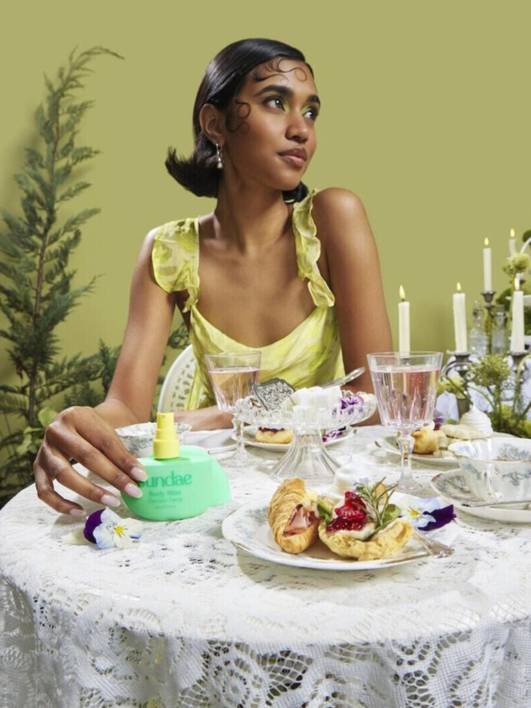
Sundae is known for its playful and recognisable approach to skincare, and the Body Mists project offered an opportunity to bring that personality into a new category: fragrance. The challenge was to create something that felt unmistakably Sundae while giving the range its own identity.
From the Y2K-inspired bottle form to the colourful personalities of the six fragrances, Jo Cutri Studio reveals how shape, colour and design came together to create packaging that feels playful, nostalgic and instantly recognisable.
Can you tell us more about Jo Cutri Studio, its story, values, and how your collaboration with Sundae on the Body Mists began?
Jo Cutri Studio is a boutique design studio based in Australia, specialising in branding and packaging design for brands around the world.
Over the years I’ve built a trusted network of collaborators and specialists, which means the studio can scale depending on the project. I work closely with clients from the first idea all the way through to final production, always aiming for that balance between something visually unique and something that actually works commercially. It needs to work in the real world, on shelf, in hand and in people’s homes.
I’d previously worked with Sundae on another product range, so there was an existing relationship when this project came along. Sundae already had such a playful and recognisable personality in skin care, so the opportunity was really about taking that into fragrance and creating something new that still felt unmistakably Sundae.
What do you feel is most unusual or innovative about the packaging?
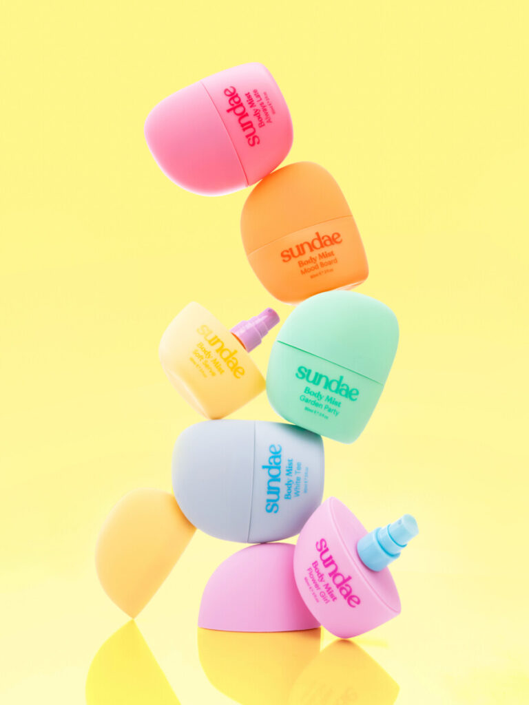
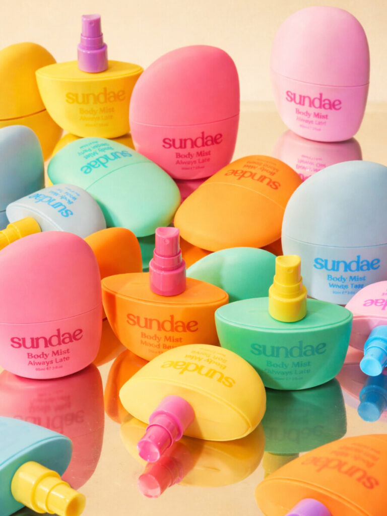
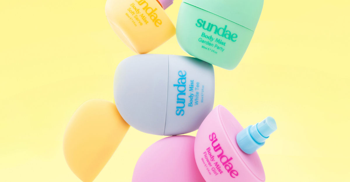
The bottle form itself. Rather than relying on graphics or a label, we wanted the shape to really carry the identity. It has a Y2K jellybean inspired feel that’s playful and nostalgic, but still clean and contemporary.
The shape gives Sundae something that can be recognised even before you see the logo, which I think is valuable in a category where so many products use fairly standard bottles. Each of the six products has its own colour palette and personality to suit the fragrance notes and mood.
Were there any challenges during the creative process, whether strategic, visual, or technical, and how did you approach them?
The main challenge was creating something that felt unmistakably Sundae without simply repeating what the brand had already done.
It still needed to feel playful, but we didn’t want it to feel like a novelty product. There was also the challenge of creating six different fragrance personalities while keeping the overall range cohesive.
A lot of it came down to form and colour. We kept the bottle shape consistent and let the fragrance colours do most of the talking. I worked closely with the talented 3D designer Paul Bui to make sure the original idea translated properly from concept into something that felt right in your hand.
From your perspective, what role does packaging play in building trust and loyalty in the beauty and body care space?
Particularly in a time when we experience brands online long before we experience their products in person, packaging is important in shaping that impression. Before someone has even tried the product, they’re already forming expectations about the quality and personality of the brand from what they see.
Trust comes from getting all of those details right and being consistent. The packaging needs to feel considered and appropriate for both the product and the brand.
Once somebody likes the product itself, having packaging that they recognise and enjoy having around helps build that brand loyalty.
How has the feedback been so far, from the client, consumers, or even the design community?
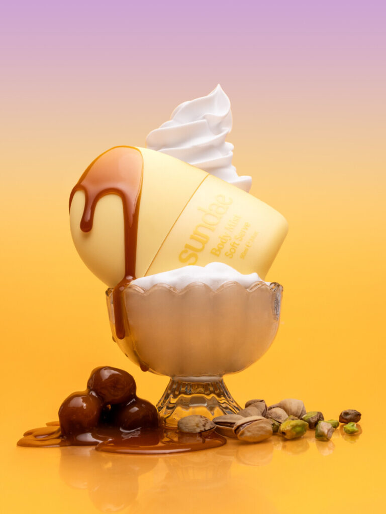
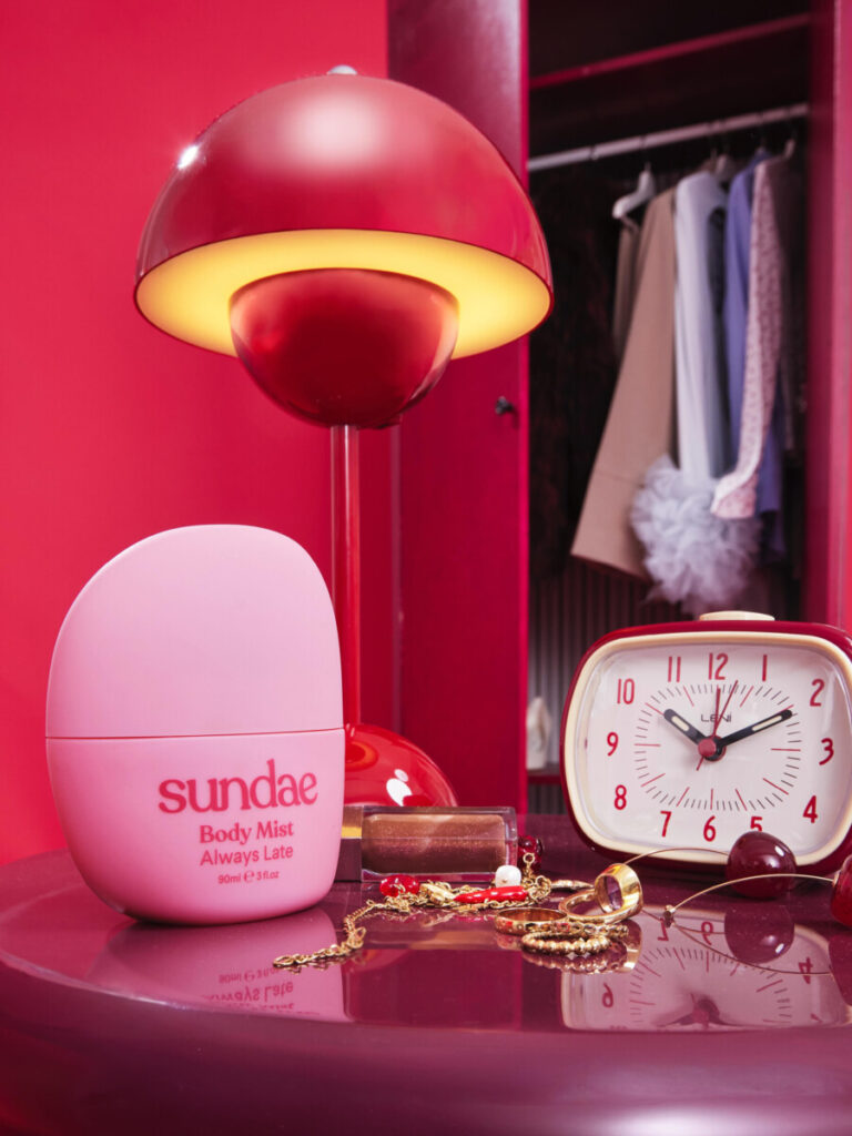
The response to the work has been amazing. Sundae put together an incredible campaign to launch the range, which really helped take it to the next level.
Sundae has also expanded as a brand in that time, so the products have ended up across a broad range of international stockists, from Harrods, Cult Beauty, Walmart, Boots and ASOS, so it’s been great seeing the packaging work in different retail environments.
From a design perspective, it’s also nice that the project continues to be noticed well after launch, Many new project enquiries often begin with, “we love the work you did for Sundae.” Being asked to be interviewed about the project is a testament to its success and is very flattering.