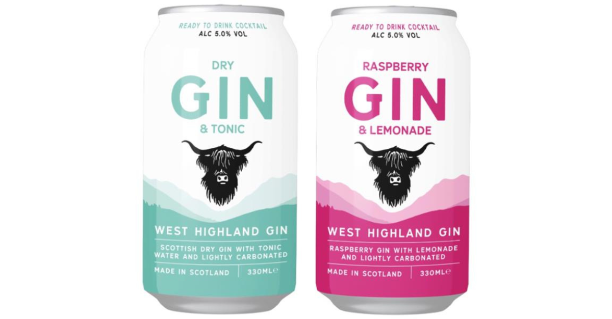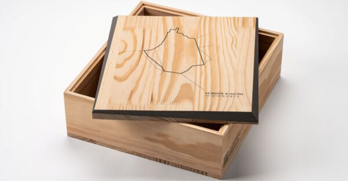
We are my Creative have designed a creative full brand identity and label system for Braw.
The packaging design reflects the misologists craft when layering flavours and spirits together to create a delicious cocktail. These flavour profiles were then used to depict Scottish landscapes in layers of colour forming a mountain range or seascape., linking the product and source directly to the brand.
A simple but iconic sun shape was adopted into the brand then hole punched out of each label and drinks card, framing the liquor as a jewel in the label and throughout the brand.

Insite Design has designed unique packaging for Dillons Distillery.
The vessel chosen was a can for its ability to open throughout the product life cycle despite sugars crystallizing or gumming up the caps of alternate containers. Insite and Dillon’s is very sustainably conscious, so a metal container is a highly recyclable choice. The label can be easily removed for separate recycling.
According to the company, “as part of that strategy we have designed a series of cocktail syrups that complement the core spirit line and support the growing home cocktail and mocktail making market. Made with the kind of honest and primarily local ingredients that Dillon’s is known for, these syrups are sure to become a staple on home bars, travel cocktail kits and cottage coolers”.

Tanning brand Bondi Sands is looking to extend its offering into skincare and chose Design Happy to design packaging for it. It was crucial that this new range not only had a ‘Bondi Sands’ familiarity to it but also cut thought the very competitive market whilst feeling both credible and accessible.
According to the brand, “We wanted bespoke packaging that sets us apart from any other skincare brand in the market whilst staying true to our brand value and look and feel. Quadpack offers hybrid and innovative packaging solutions and pushes the boundaries in what can be achieved in packaging”.
The range has bottles and caps in PP, and five-layer tubes with PCR content, both 100% recyclable. The decoration techniques used are silk-screening and hot stamping.

Hugmun Studio has designed packaging for MURRE, a skincare brand that creates superior, sustainable cosmetics from clean formulations.
According to Hugmun studio, “Our vision for MURRĒ came quite naturally. During the process we started playing with ingredients as collages, and this became the main element of the packaging. Like the products, the brand feels minimalistic, fresh and artistic”.
By mixing sculptural objects representing the ingredients mixed with minimalistic elements of the layout, the designers created a fine balance, resulting in a sophisticated packaging design.