
With Halloween just around the corner, we invite you to check out Fortnum & Mason’s quirky and inventive Halloween themed confectionary packaging.
Fortnum & Mason were long awaiting a rebrand for its Halloween range and so employed Kate Larsen to create a more sophisticated range that appeals not only to families but to its discerning core customer base.
The packaging design is not only inventive and incredibly intricate, it also maintains Fortnum & Masons trademark wit and humour through its Halloween-themed illustrations.

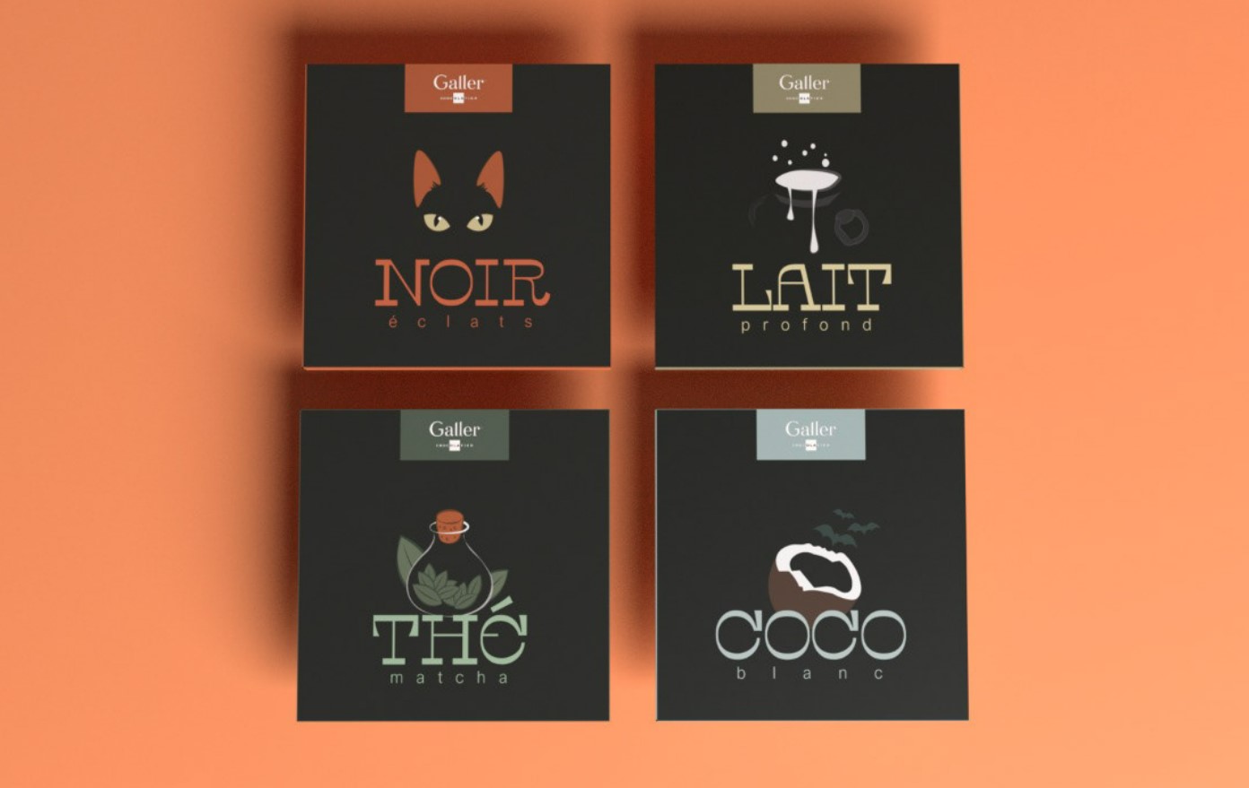
It’s spooky season! Check out ‘Galler’ – a spooky edition chocolate.
Each of the four variations of Galler chocolate were chosen carefully to create a spooky edition for the brand in a clean and refined way.
Each variant also has their own Halloween-inspired illustration, finished with a refined typography and a matte finish.
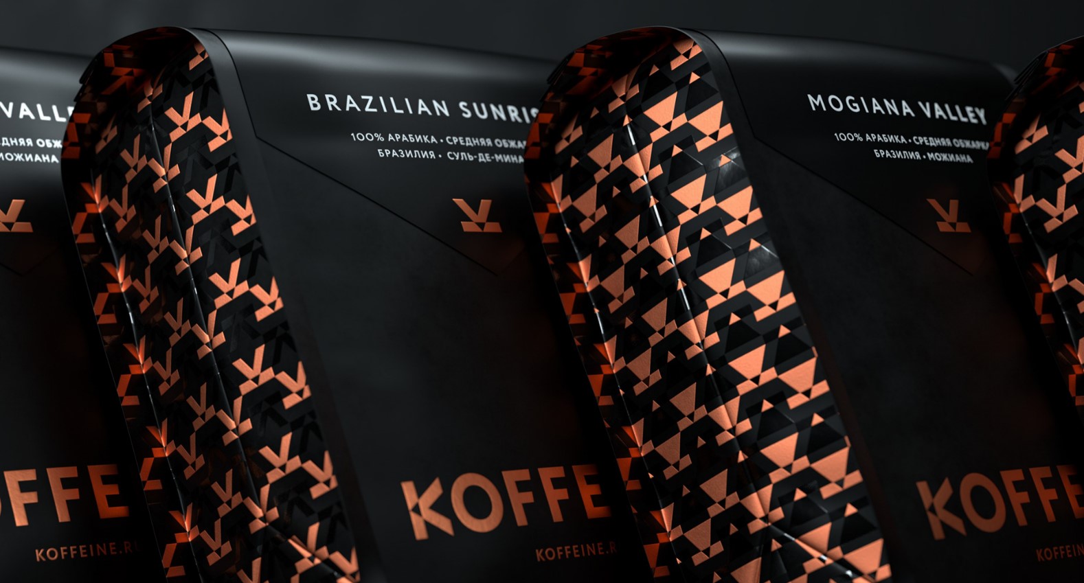
Moscow-based independent coffee roaster, Koffeine, are a brand that want their customers to experience exclusive level coffee at home.
To meet their premium coffee, the owners of Koffeine wanted their packaging redesign to reflect high-quality and exclusivity; as part of their brand identity.
Designers at Cult Bureau translated Koffeine’s core brand messages with a bold visual identity, including logotype symbol and pattern system. Additionally, the cup symbol follows the letter ‘K’ for Koffeine, and powerfully connects all elements of brand identity.
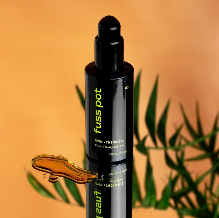
Fuss pot, a hemp-based skincare brand, worked alongside packaging designer, Curious, to create a sophisticated yet modern packaging design system.
The designers’ goal was to break the mould; the existing market of hemp products are mainly packaged in neutral tones. The bright colours and images alongside the black typography create a professional perspective for the brand.
The designers at Curious said: “Our challenge was to break this mould, with a design programme that reflected the product’s natural origins, whilst communicating the contemporary, performance-focussed features that made it so unique”.