Tell us a bit about the brand – its heritage, its story, and its markets – and the brief for this project. How does the design express the brand’s values?
Distillery De Moor is a family business guaranteeing passion and craftsmanship since 1910. The production is rooted in years of experience. The traditional products that they produce from way back have a permanent place in their range, and are still manufactured according to the recipe of yesteryear.
This particular distillery is one of the last hot distilleries in Belgium, which means that the whole process happens in-house, from the grain to the liquid, all the while respecting traditional craftsmanship. Labeling happens manually and in-house and the end result is always honest and true.

What inspired the design?
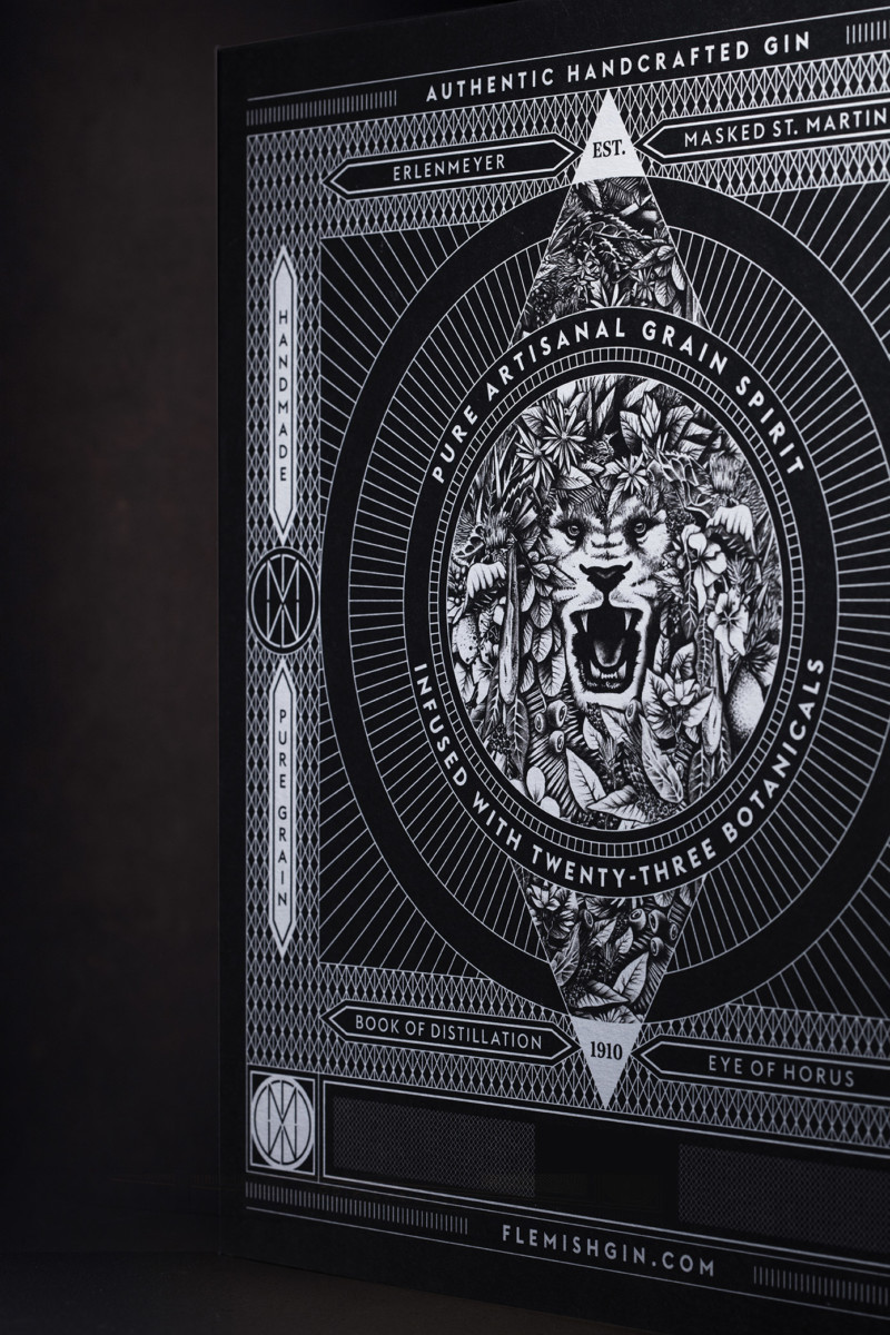
One of the characteristics of the brand is that it is more than 100 years old. DeMoor is a family owned business since 1910 and the recipe of the gin is inspired by an old book of distiller’s secrets. This book is represented on the label and in the box. So a very natural creative gesture was to imagine this box in the form of a book, in the likes of Collection Hetzel’s Jules Verne ancient books.
The custom illustrations tell the story of De Moor. The conical flask refers to the craft and the artisanal product. Saint Martinus, patron of the city of Aalst wears a mask to create a link with the carnival culture. The recipe book hints at the ancient secret family recipe. The All-Seeing Eye signifies the craftsmanship of the distiller.

What is unusual or innovative about this pack?
The two-faced lion makes this design unique. Distillery De Moor is rooted in the carnival culture of Aalst, one of the biggest cities in the province of East-Flanders. The lion is Flander’s regional symbol, and refers therefore directly to both the roots of the distillery as well as the origin of gin. The two-faced lion also refers to the dualistic character of De Moor, which is not only an artisanal distillery, but also a business and shop selling wine and spirits. This duality is visible through the mirror-like lay-out, as well as the construction of the logo.
What challenges did you need to overcome when manufacturing this pack?
The biggest challenge was to respect the original identity graphic system whilst taking into account the constraints of hotfoil printing. The graphic narrative needed to be rich and varied and the technique able to follow the design in an impeccable execution.
What reactions have you had from consumers?
According to the designer “We are still at an early stage of sales so it is premature to talk about consumer reactions. However, from the retail trade feedback we can say people are excited about this very strong and qualitative presentation of a small batch artisan gin”.
Design: Sign Brussels
Product: De Moor Flemish Gin 23
Launch date: 2021

Cedric Zwaenepoel, Product Designer
Connect with Cedric :