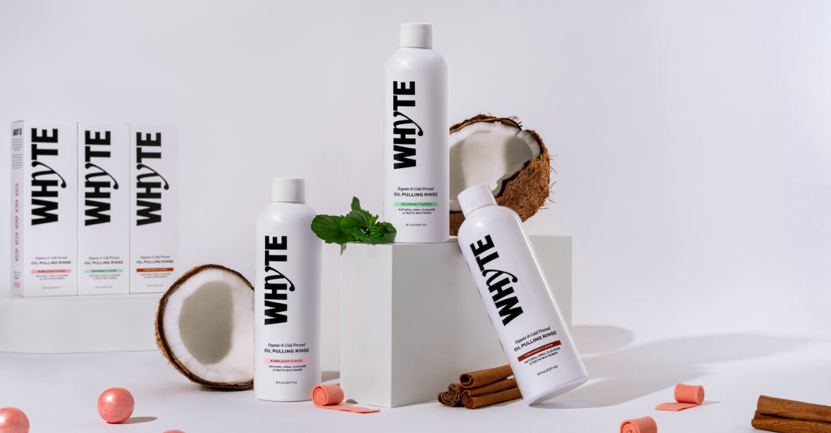
Exclusive | Designing purity and impact in oral care with WHYTE
In this interview, we speak with Morgan Hastie, founder of The Logo Lassie. She talks about her creative journey designing the identity and packaging for Whyte. Whyte is a premium oil pulling brand bringing a fresh perspective to the wellness and oral care space.
Founded by Shubhangi Tyagi, Whyte set out to create “America’s cleanest oil pulling rinse,” made with the finest cold-pressed oils and rooted in holistic health and sustainability.
Morgan’s challenge was to translate these values into a design that felt instantly clean, premium, and distinctive in a market often dominated by conventional cues. From the bold choice of a white bottle to a visual identity that balances minimalism with strong, confident details, the design sets Whyte apart while resonating with modern consumers.
Can you tell us more about the brand, its story, values, and how your collaboration began?
WHYTE was founded by Shubhangi Tyagi, who grew up experiencing the benefits of oil pulling and wanted to create a clean, organic alternative using only the finest cold-pressed oils after realising that there was a gap in the market for a product like this.
The brand is all about holistic health, wellness, innovation and quality, with products made from sustainably sourced ingredients. They first found me on Instagram and got in touch through my website. After our first call, it was clear we were a great fit, they valued my experience in visual identity and packaging, and I was excited to bring their vision to life.
What do you feel is most unusual or innovative about the packaging ?
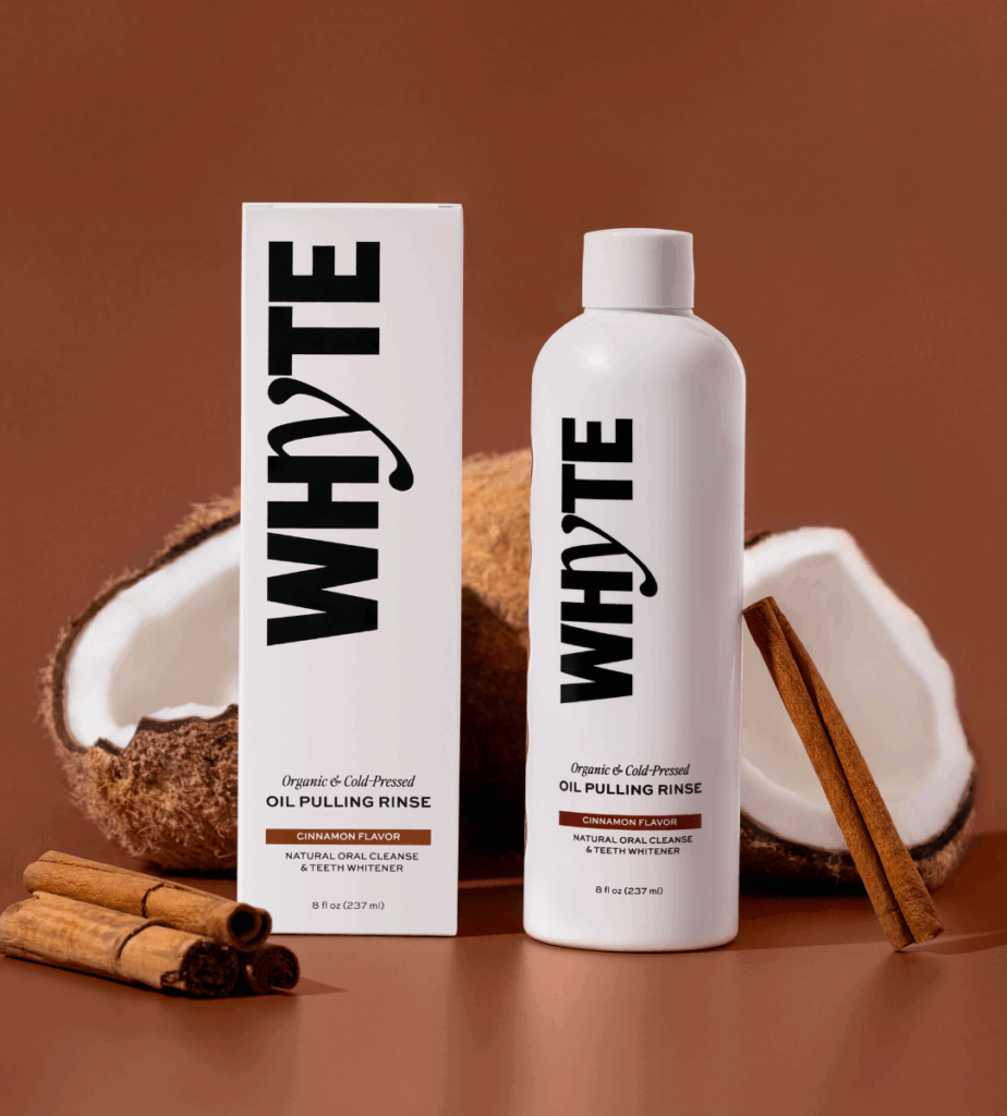
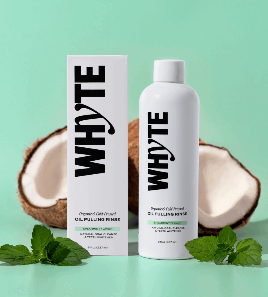
When we lined up the existing oil pulling market, one thing stood out, no one was using a white bottle. Shubhangi had said, “We want to make America’s cleanest oil pulling rinse,” and it clicked. A white bottle with plenty of white space instantly communicated that clean, premium feel, tied into the teeth whitening benefits of the product, and, of course, connected back to the brand name.
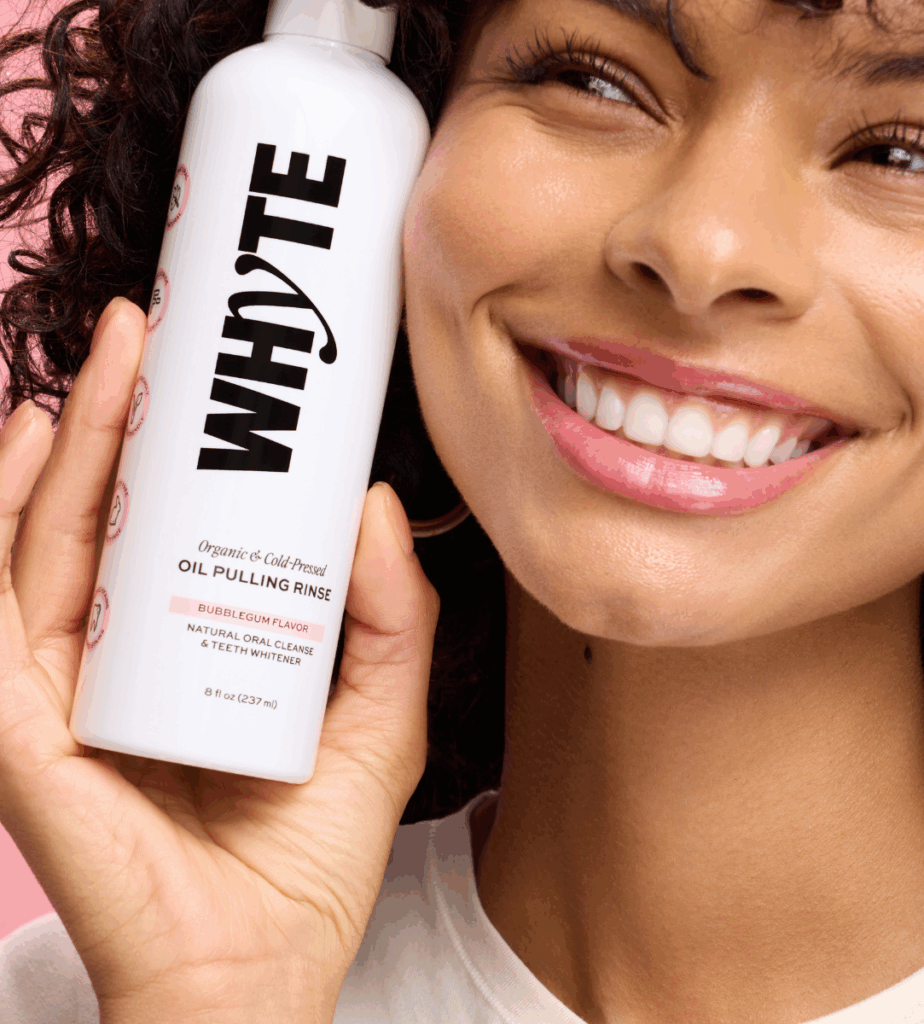
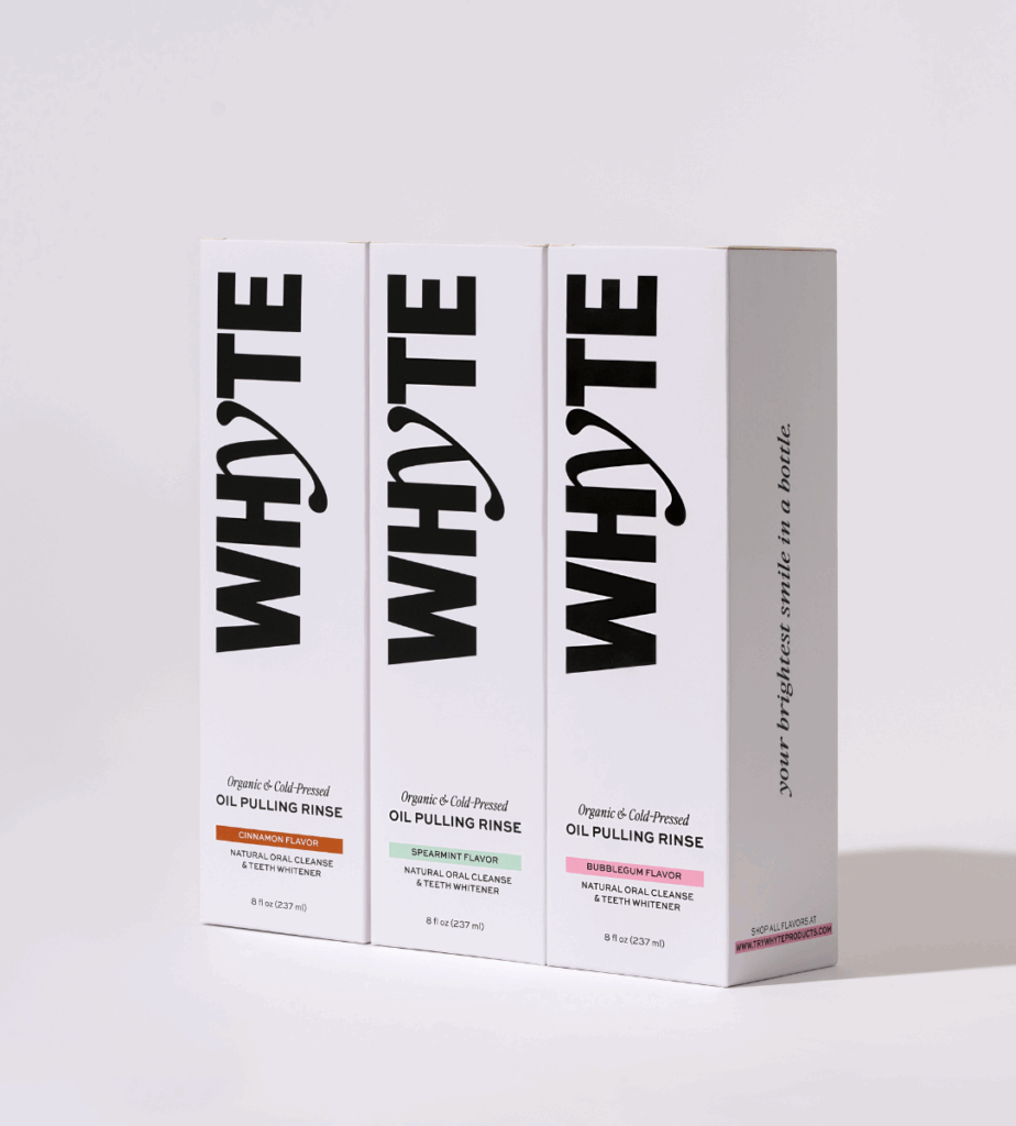
The visual identity is bolder than most in the oral care space. The charcoal black detailing really pops against the white, and the logo was designed to emulate the motion of swishing, making it feel like part of your morning routine. We also introduced subtle pops of colour to differentiate flavours and bring a little freshness to the range, leaving room for future product expansion and the addition of more colours when necessary.
From your perspective, what role does packaging play in building trust and loyalty in self-care or wellness brands?
I think in self-care and wellness, packaging is often the first handshake between a brand and the customer. If it feels high-quality, hygienic, and intentional, people are far more likely to trust what’s inside. With Whyte, we wanted the design to be as clean and premium as the formula itself.
We quickly realised that the target market for this brand values both effectiveness and aesthetics, so it had to be a product people were proud to keep on their bathroom shelf. And, with social media as the brand’s primary marketing platform, it also needed to stand out and photograph beautifully online.
The minimal, confident layout reflects a brand that knows exactly what it stands for, while subtle flavour colour pops make the range easy to navigate. Every detail was considered, and I think that’s what builds trust and loyalty over time. Because we developed a modular system, that same brand feel now carries across new product launches; people instantly recognise it and associate it with Whyte.
How has the feedback been so far, from the client, consumers, or even the design community?
The feedback has been amazing. The team at Whyte have been so supportive from day one, and I’ve loved becoming almost an extension of their in-house team. The brand has gone viral multiple times and sold out its inventory five times over, which has been incredible to see.
The response from customers has been so positive, and with more product launches in the works, the momentum doesn’t seem to be slowing down any time soon. The design community has been great too, when I shared the project, it was reposted by several larger accounts, and it was so rewarding to see people connect with the design and understand the strategy behind it. It’s been such a rewarding project to be part of, and I’m excited to see where the brand goes next.