


Exclusive | Maison Myrthus: Redefining the art of gifting through packaging
In this interview, we speak with Maxime Trassaert, Founder and Creative Director of Amertume Studio, the Paris-based creative studio behind the brand identity and packaging for Maison Myrthus. With a multidisciplinary background spanning strategy, branding, packaging, imagery and retail design, Maxime shares the thinking behind this new Swiss gifting house and the creative world developed around it.
For over fifteen years, Maxime Trassaert has helped brands build distinctive and coherent worlds. After spending ten years in retail design, he gradually broadened his practice to encompass brand strategy and identity, graphic design, packaging and commercial interiors. Throughout his career, he has collaborated with brands and houses including Van Cleef & Arpels, L’Oréal, Sephora, Veuve Clicquot, Le Bristol Paris, Nike and Ladurée.
Can you tell us more about Amertume Studio, its story, values, and your approach to branding and packaging design?
Amertume Studio was born in 2023 from a desire to bring together the different disciplines that have shaped my career: strategy, visual identity, packaging, imagery and retail design.
The studio initially grew internationally, particularly in the United States and the Middle East, working with emerging brands and established houses across beauty and fragrance, fashion, and food and beverage. We then gradually strengthened our presence in France through collaborations with houses such as SABON and Maison Crivelli. This journey allows us to combine a Parisian sensibility with an international perspective.
We believe a brand should be built around a coherent vision. Strategy, identity, packaging, imagery and physical spaces should all contribute to the same story. Our role is to identify what makes a brand distinctive, then translate that idea into a clear, consistent and recognisable visual language.
Packaging plays a central role in our approach because it is often a person’s first physical encounter with a brand. Beyond its function, we explore how it makes people feel through its design, details, materials and textures, and the impression it leaves behind.
Our values centre on curiosity, high standards, coherence and close collaboration. As an independent studio, we work closely with each client and maintain a unified creative vision, from the initial strategic thinking through to the final details of execution.
What can you tell us about Maison Myrthus, its story and positioning, and how your collaboration with the brand began?
Maison Myrthus is a Swiss house dedicated to the art of gifting. It was founded on a simple belief: a gift is never just an object. It is an expression of care, an emotion and a moment of connection between the person giving it and the person receiving it.
The house offers a carefully curated selection of objects made exclusively in Switzerland. Its positioning is rooted in quality, provenance, local craftsmanship and a more conscious approach to consumption. At a time when gifting can sometimes feel rushed and impersonal, Maison Myrthus seeks to restore meaning to the gesture, the time spent choosing an object and the way it is presented.
Maison Myrthus approached Amertume Studio directly to rethink its brand identity and design its entire packaging system. From our first conversations, we understood that our role was to build a complete world around the ritual of gifting.
Our aim was to translate this vision into an identity that combined emotion, precision and craftsmanship. It needed to convey the house’s premium positioning while remaining warm, sincere and approachable. Its Swiss roots also had to come through in the restraint of the visual language, the quality of the materials and the commitment to local production.
What creative thinking guided the brand identity and packaging design, and what did you want the design to express about the art of gifting?
Our creative thinking began with a question: how could the act of giving become a distinctive brand language?
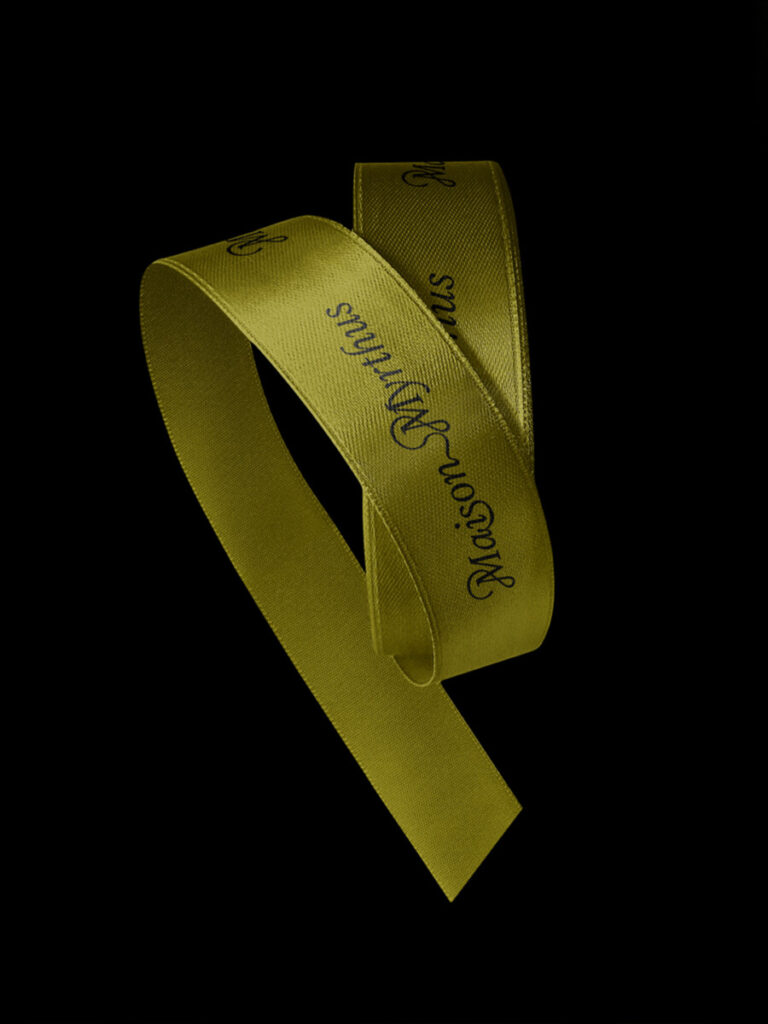
We looked first at the gesture surrounding the object. The ribbon quickly emerged as the central idea of the project. It is one of the most immediate and universal symbols of gifting, but it also evokes the care that goes into preparing a gift, the anticipation before opening it and the moment of discovery when it is untied.
We wanted the ribbon to become the foundation of the identity. Its curves and folds form the Maison Myrthus logotype, shape the graphic compositions and extend across the brand’s various touchpoints. A familiar gesture becomes a contemporary and distinctive visual signature.
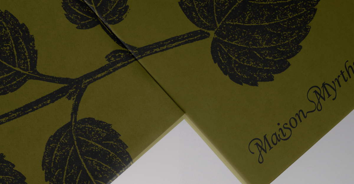
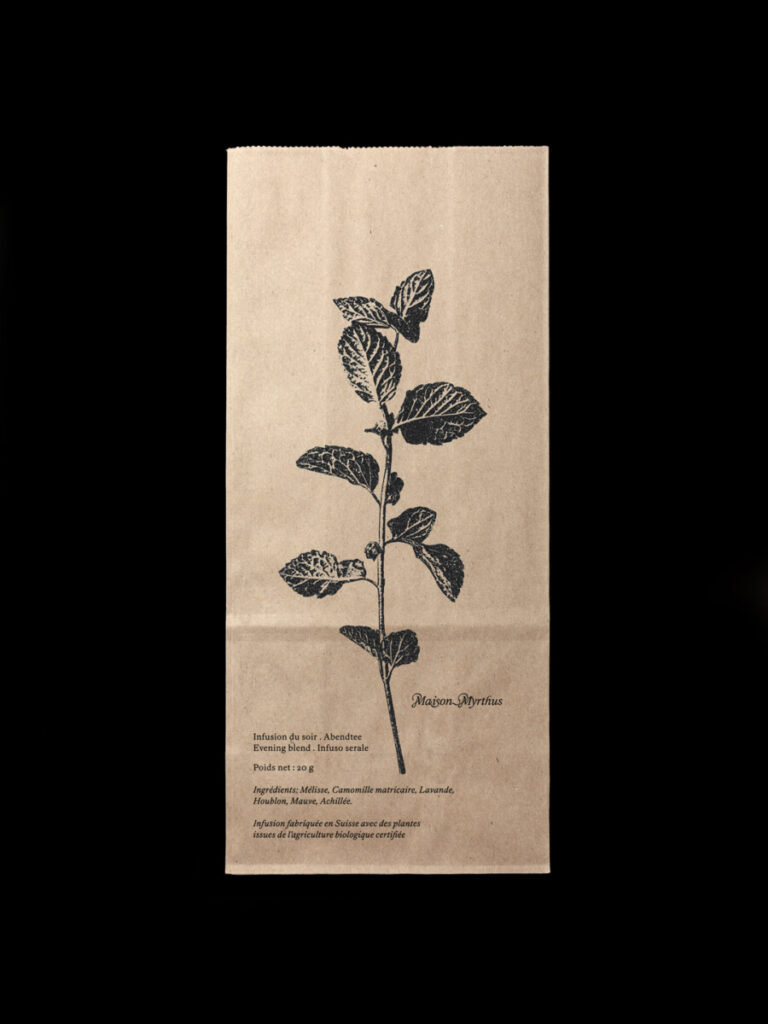
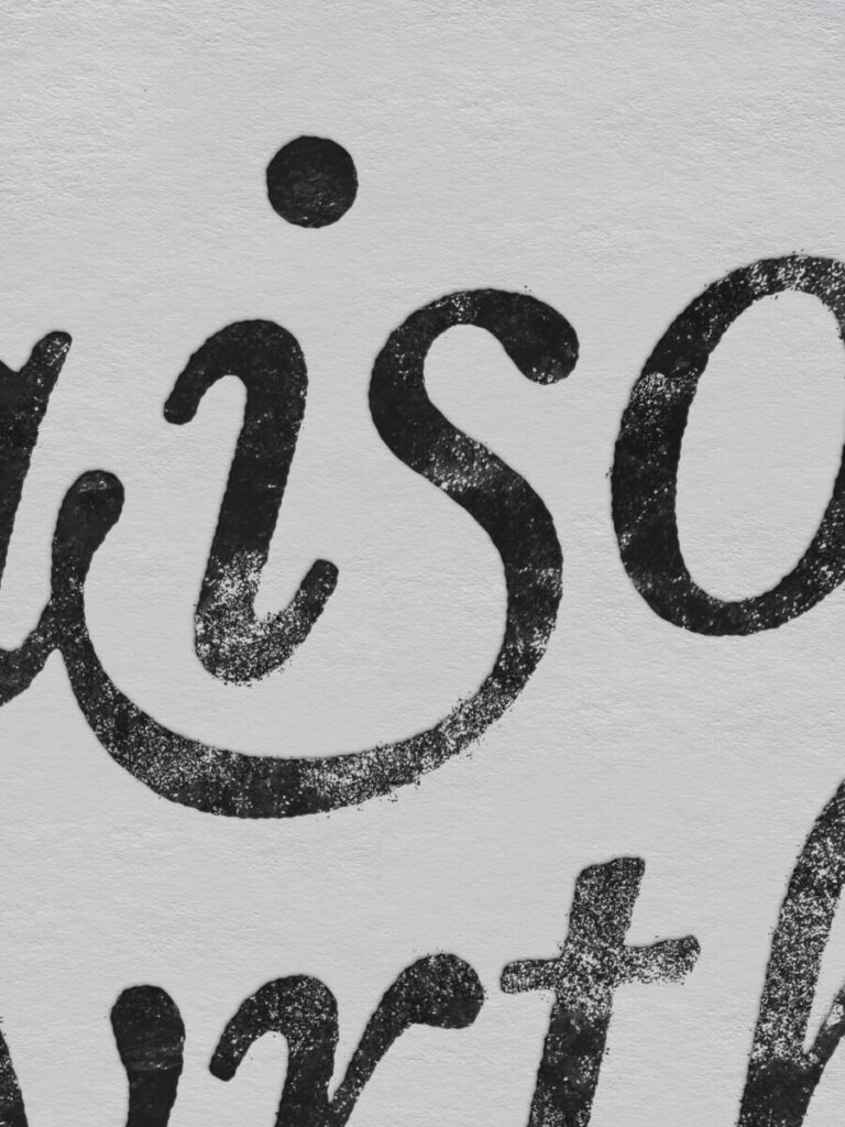
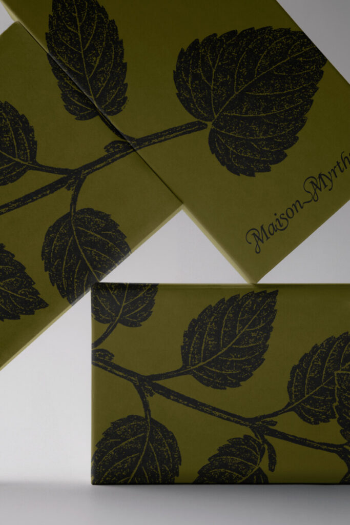
For the packaging, we developed a complementary language inspired by traditional stamps, vintage labels and artisanal printing techniques. This direction evokes provenance, authenticity and the trace of the maker’s hand. Textures and subtle irregularities bring warmth to the precision of the identity and echo the craftsmanship behind the objects themselves.
By bringing together the ribbon and the printed impression, we wanted to express a vision of gifting rooted in care, emotion and intention. The design should contribute fully to the ritual, making every detail feel as though it had been considered especially for the recipient.
What do you consider the most distinctive aspect of the packaging, and how does it help Maison Myrthus stand out in the gifting market?
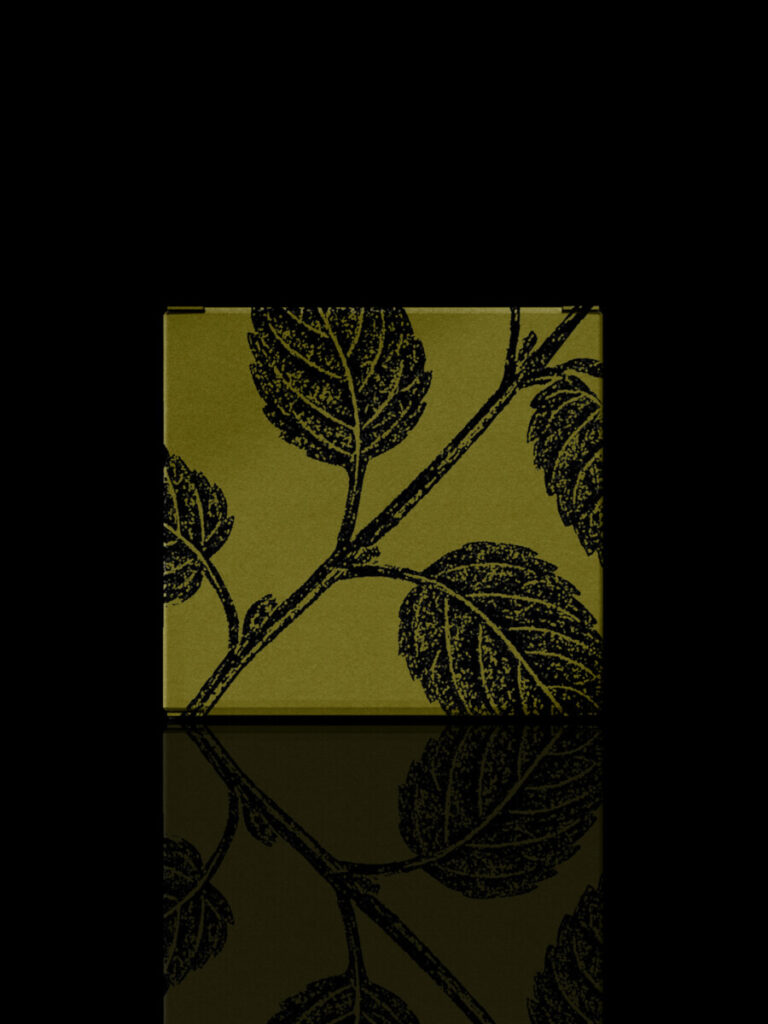
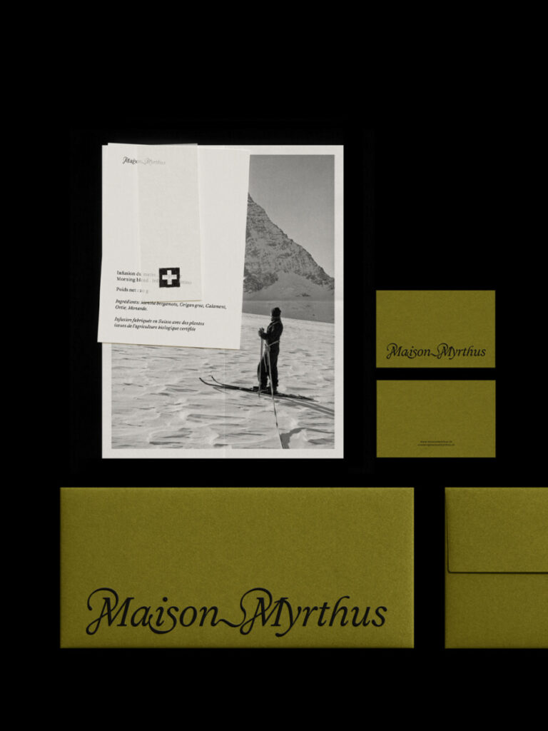
The packaging’s distinctive character comes from the interplay of several elements: a strong, immediately recognisable visual identity, black embossing that adds dimension and depth, a distinctive shade of green that becomes a signature brand colour, and the deliberate imperfections of its printed graphics.
We chose to embrace textures, variations in ink and the irregularities associated with artisanal printing techniques. The graphics were designed to feel as though they had been applied directly to the material, almost like a stamp. This gives the packaging the quality of a physical impression.
The contrast between the precision of the identity, the depth of the black embossing, the presence of green and the expressive quality of the printing gives the packaging a contemporary, tactile and lively character. Each piece has its own personality while remaining immediately recognisable as Maison Myrthus.
In a gifting market often defined by elaborate decoration or sometimes impersonal minimalism, Maison Myrthus offers a more human expression of refinement, rooted in colour, gesture, materials and craftsmanship.
Were there any challenges during the creative process, whether strategic, visual, or technical, and how did you approach them?
Production was a key consideration. From the outset, the ambition was to produce all the packaging in Switzerland, from paper and board sourcing through to printing and finishing. We worked with a small Swiss workshop, prioritising kraft paper sourced and produced in Switzerland, locally manufactured recycled board made from responsibly sourced materials, and non-toxic inks.
Textures, ink variations and embossing could not be assessed on screen alone. They required several rounds of physical testing, adjustments and close dialogue with the manufacturers. We treated these constraints as an integral part of the creative process. The behaviour of the materials and the particular qualities of the printing gradually enriched the project, helping shape its tactile, expressive and authentic character.
From your perspective, what role do you think packaging plays in turning a gift into a memorable experience?
Packaging is often the recipient’s first physical encounter with a gift. Before discovering the object itself, they experience its design, materials, textures and the care with which it has been prepared. It builds anticipation and immediately conveys the thought behind the gesture.
Untying a ribbon, peeling back a sticker featuring an embossed monogram, lifting a lid, unfolding tissue paper and gradually revealing an object all help slow the moment down and create a ritual. Packaging becomes part of the emotion and can make the experience as memorable as the gift itself.
For Maison Myrthus, we explored the art of gifting by considering every stage of discovery as part of the experience. Opening the shipping box, finding a card, removing a sticker, unfolding the tissue paper and finally revealing the gift creates a sequence of gestures and emotions. Each element extends the house’s world and makes opening the parcel a thoughtful experience in its own right.
How has the feedback been so far, from the client, consumers, or even the design community?
The response to the project has been extremely positive, both from the client and from the international design community.
Maison Myrthus was very receptive to the creative direction and to the idea of building its identity around a universal gesture. Close collaboration between the brand, our studio and the production partners was essential to preserving the original intention throughout development.
Since its unveiling, the project has been shared or published by around fifteen international platforms specialising in branding, packaging and design, including Pentawards, Mindsparkle Magazine and Beyond Branding.
These features have further strengthened Amertume Studio’s international visibility and highlighted our ability to create distinctive brand worlds in which identity and packaging express the same compelling idea. Following this coverage, several brands have approached us to explore potential branding and packaging collaborations.
Brand identity and packaging design: Amertume Studio®
Share this article

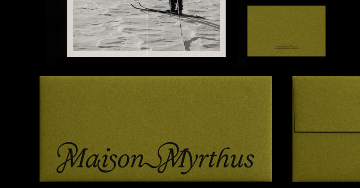
Photo de www.industries-cosmetiques.fr
Subscribe to our newsletter
The latest articles from Paris Packaging Week