
Tell us a bit about the brand – its heritage, its story, and its markets – and the brief for this project. How does the design express the brand’s values?
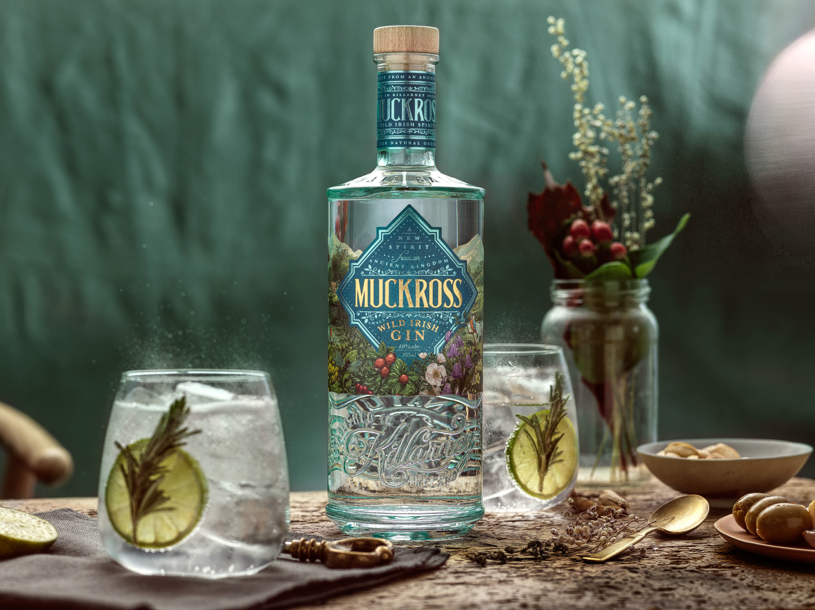
The concept for this project was to amplify the brand story through the premium and bespoke packaging that is layered with detail and design elements to invite the consumer into the secret garden of Muckross. This new spirit brand was born in Muckross, Killarney, a mystical part of Ireland that remains unspoiled by time, and hides a natural garden of delicate flora, wild fauna and bountiful meadows that inspired this wild and unhurried gin with an unmistakable wild side.
The centrepiece of the label pays homage to Muckross house, a nineteenth-century Victorian mansion that is nestled in the stunning beauty of Killarney National Park. Taking inspiration from the Tudor-style design of the house, we created a unique shield to echo its striking and unique architecture.
What inspired the design?
The specially commissioned illustration on the front label celebrates the understated wild vistas of Muckross – from its world-renowned peaks to its fabled waterscapes and native blooms and inhabitants. Look closely and you will discover a natural, unspoiled paradise: spot the majestic Irish red deer grazing in the hills, the serene heron standing still in the glimmering lake, the curious robin chirping to passers-by and protecting his territory, the colourful kingfisher showing off his natural beauty, and the native Northern Emerald dragonfly enjoying his own little pocket of paradise.
In essence, the packaging is a modern look at the magical beauty of this mysterious part of Ireland, the design being a strong element of the brand narrative that calls you to connect with a new spirit from an ancient kingdom.

What is innovative or unusual about the pack?
The main typography used for the Muckross word mark is custom-designed, a minimalist and bold twist on decorative Victorian fonts. The typography is framed by tumbling foliage that invites you to discover the abundant native botanicals that sparked the concept for this smooth and mellow gin.
The custom-designed bottle is a nod to the traditional Victorian glass bottle, modernized with tactile embossing and a unique design. The three-dimensionality is a key element: around the neck the words “‘small batch” and “Irish spirits’” speak to the origin of the gin, on the back the slogan of the brand “The natural order” is captured in an intricate roundel, and on the bottom of the bottle, you’ll find the Irish toast: “Sláinte is táinte” (which translates as “to health and wealth”).

Product: Muckross Wild Irish Gin
Agency: Backbar Studios
Creative director: Conor Smyth
Launch date: 2020
Launch country: Ireland
Find out more about Muckross Wild Irish Gin