Tell us a bit about the brand – its heritage, its story, and its markets – and the brief for this project. How does the design express the brand’s values?
Maison Venkov designed this spirit to commemorate AMAN Tequila Añejo founder’s 15 years of educational public service. It is a symbol of his classroom values: tenacity, perseverance, ambition, determination, hope, kindness, and love. It is dedicated to all people who are the pillars of change, hope, strength, resiliency, perseverance, and pride.

What inspired the design?
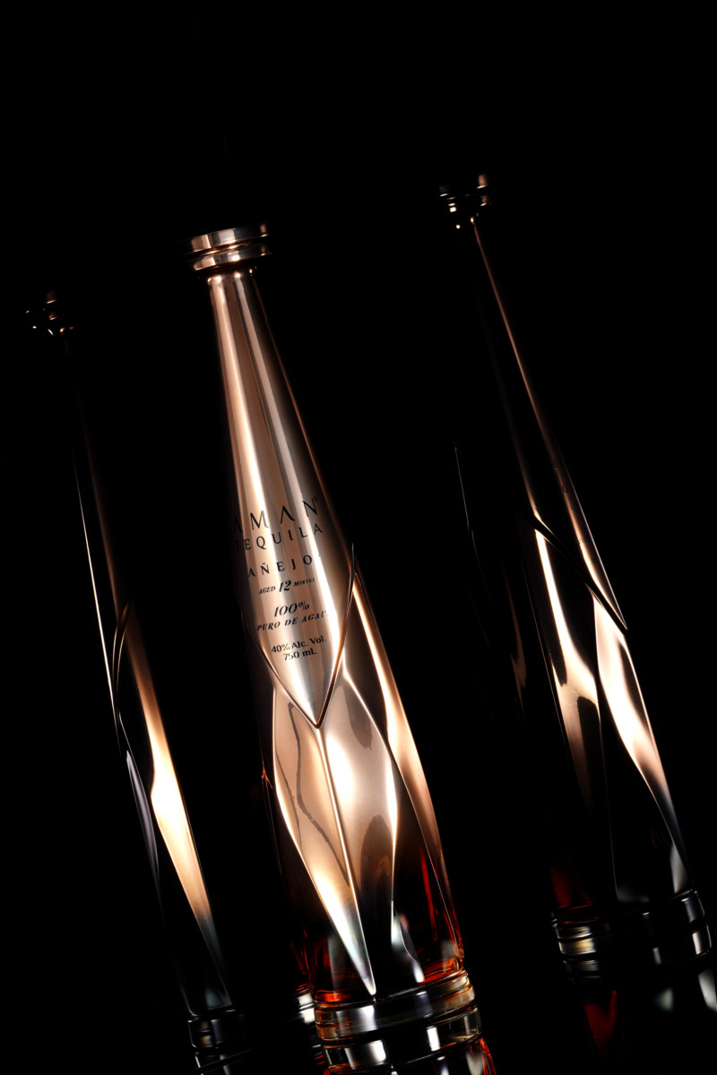
El Profesor stands tall being the only Rose Gold gradient-metalized tequila bottle on the market. Contemporary interpretations of the “Coa” are found on the back of the bottle. This is a blend of nature’s inspiration, featuring stylized pointed agave-like shapes and contemporary, slender forms, making a way for the iconic, sculptural towering look. The vertical form is further accentuated by the innovative metallic gradient – the first of its kind on the market – which reveals the precious liquid and glass on the wide side of the bottle.

What is innovative or unusual about the pack?
According to the designer, “The metallic gradient is very unique as it reveals the precious liquid and glass on the wide side of the bottle. The execution of the gradient in this format and correct quality is currently possible only at several factories in the world”.
Product: Tequila Aman
Agency: Maison Venkov
Launch country: US
Find out more about Maison Venkov