Design Case Study | Porter Packaging’s design for Moksha Spirits

Moksha is a new spirits company inspired by one of the founder’s personal experiences and connection with India. Crafted in Aotearoa New Zealand, it’s the spirit for free spirits. Fiercely flavourful, Moksha prowls the palate by challenging the conventions of what traditional spirits should taste like.

Tell us a bit about the brand – its heritage, its story, and its markets – and the brief for this project. How does the design express the brand’s values? What inspired the design? 

The inspiration for Moksha came from many years spent in India by one of the founders.

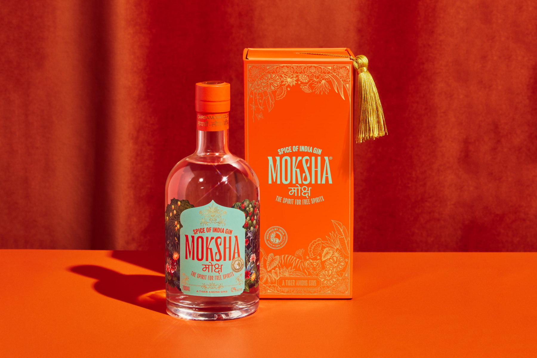
Our brief was to develop the brand’s identity, packaging, imagery and website to launch their first product, the Spice of India Gin, for sale within the New Zealand market.

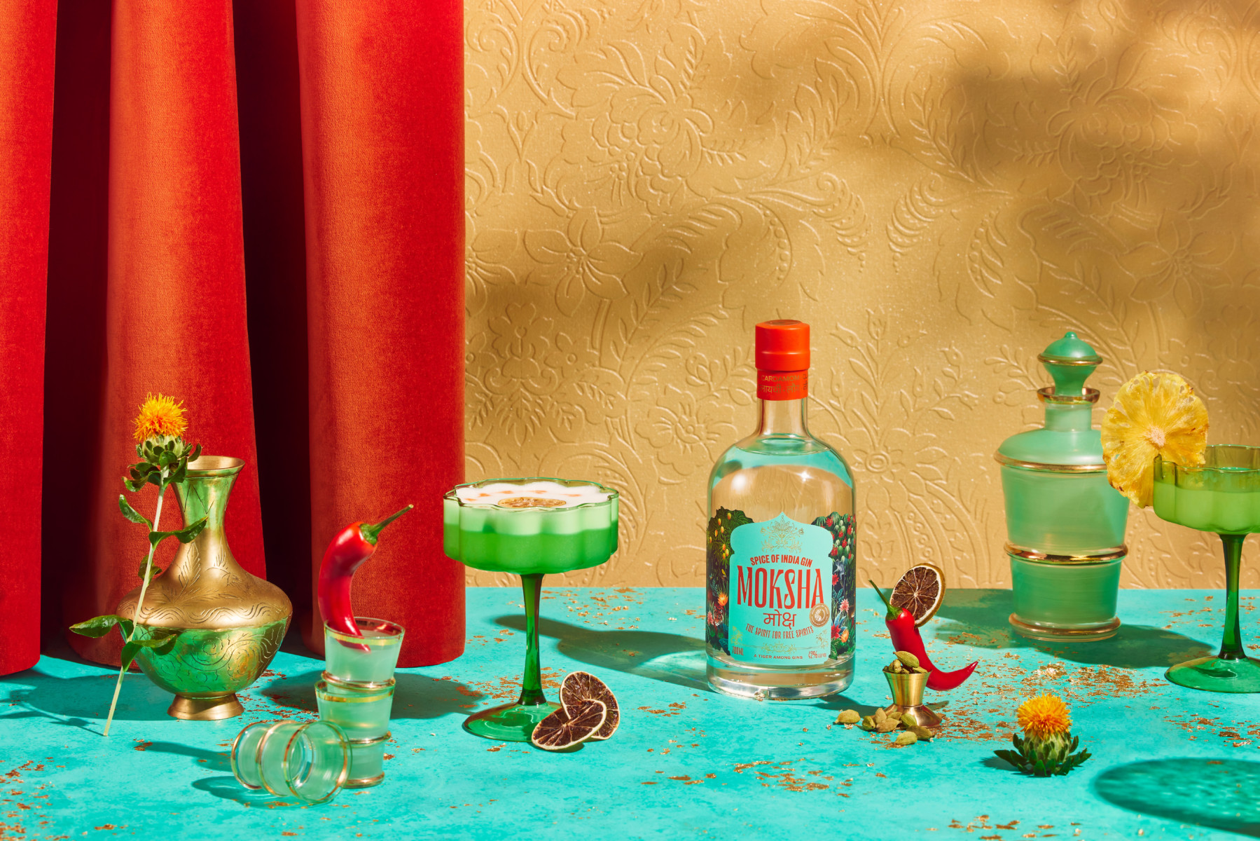
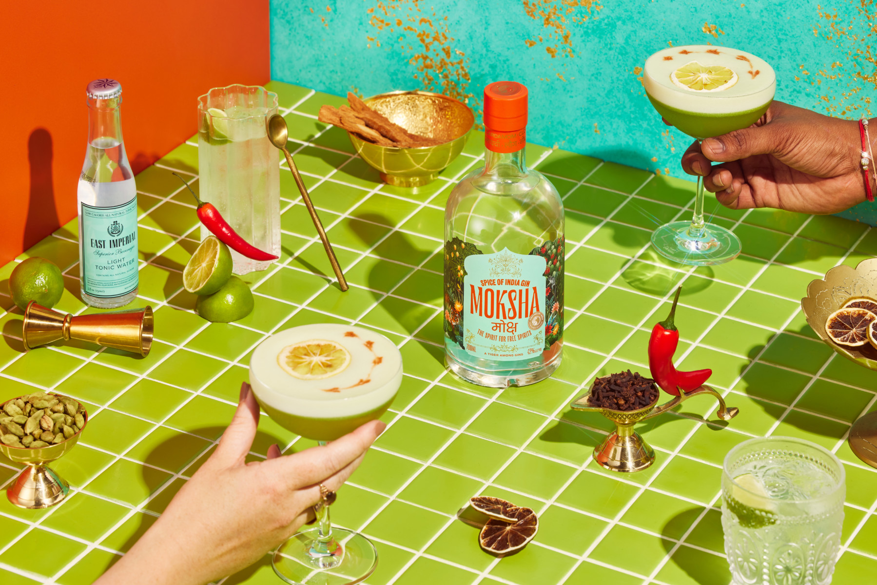
In a highly competitive and saturated category, the Moksha brand aims to overload all of the senses, from sight and smell to taste and touch, just like India does. It’s a brand that strives to embody the vibrancy of this wonderful country and take consumers on a journey from their everyday.

As the most tangible and tactile aspect of the brand, we wanted to create a packaging experience like no other in the category to provide stand out on-shelf and in-hand. Every detail was considered from the structural and opening mechanics through to the design and production of intricate visual and textural elements.

What is innovative or unusual about the pack? 

The gold tassel was a vital element we wanted to incorporate. Visually so rich and associated with India, it is the hero element of the heavily embellished, ornate and tactile packaging.

What technical challenges did you need to overcome to manufacture this pack?

Budget limitations were one, with the cost of a rigid box being too high at this stage in the business’s life. Porter helped us come to a solution where we could still achieve a premium box solution out of e-flute, elevating the finished product with print techniques such as gold foil and embossing.

Technically, the tassel took some work to get functioning well as an opening mechanism for the drawer box, while still feeling like a sleek design element. Initially toying with a loop hole design, before settling on a hidden attachment on the underside of the lid.

What reactions have you had from consumers?
 
Response has been overwhelmingly positive from both consumers and retailers wishing to stock Moksha. The packaging is often described as beautiful and is seen as the cherry on top of a seamless brand experience from website to doorstep.
Agency: Libby & Ben
 
Pack Manufactures: Porter Packaging
 
Product: Moksha
 
Launch Location: New Zealand

Share this article

Facebook
Twitter
LinkedIn