In this interview, we speak with Willem Louwers, Founder of LOUERS vodka, about the story behind the brand’s striking new bottle design. Created to challenge convention in the ultra-premium spirits category, LOUERS combines bold aesthetics with traditional Dutch craftsmanship.
From its origins in Shanghai’s nightlife scene to its presence in 35 countries today, the brand has taken a distinctive path. Louwers shares how the design came to life, what it represents, and how it reflects the brand’s aim to stand out, visually and experientially.
Tell us a bit about the brand – its heritage, its story, and its markets.
LOUERS vodka was founded with a singular mission: to break the mould in the ultra-premium spirits category.
I started with LOUERS vodka at age 19 after being immersed in Shanghai’s vibrant high-end nightlife scene, where I noticed a surprising absence of vodka brands that truly stood out—visually and experientially.
Driven by that realisation, I set out to create something radically different: a brand that fuses bold, disruptive design with traditional Dutch craftsmanship.
At the time, I had zero experience in spirits or bottle manufacturing. Ironically, that became an advantage—it allowed me to design without being constrained by the rules or limitations of bottle production. The concept I envisioned ultimately took five years to develop—from rough sketches to the finished, scalable product you see today.
LOUERS vodka is distilled in the Netherlands using high-grade Dutch wheat and reverse-osmose filtered spring water. We are currently distributed in carefully selected high-end venues and retailers across 35 countries.
How does the design express the brand’s values? What inspired the design?
Our philosophy is simple: Born to Stand Out. This belief flows into every design decision.
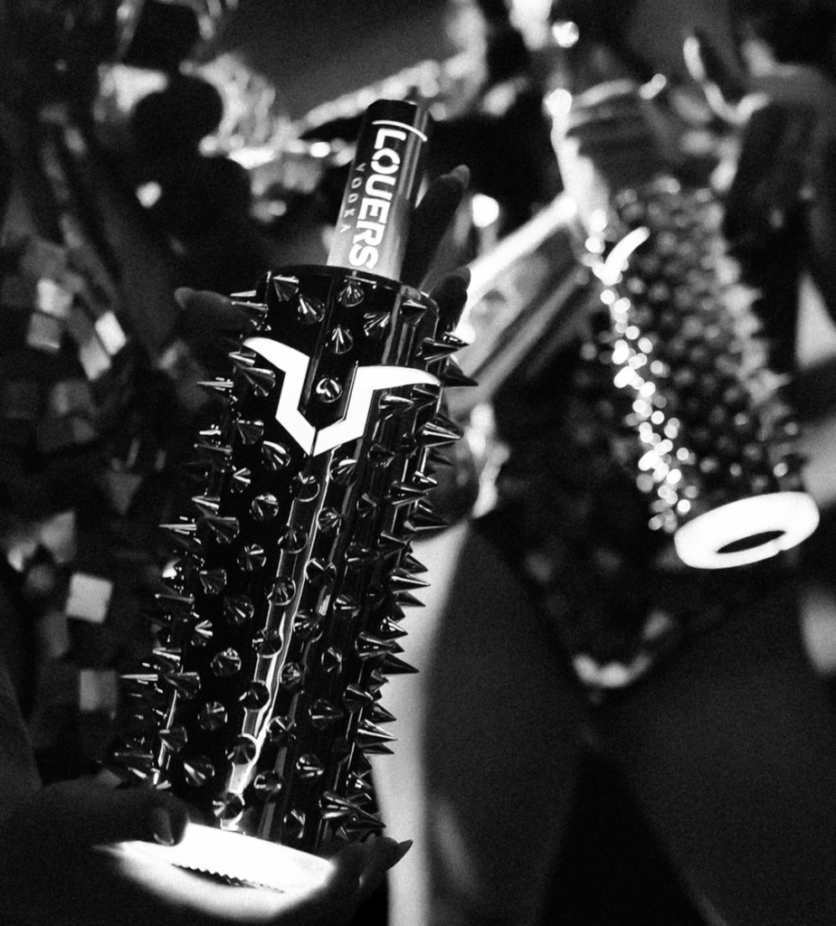
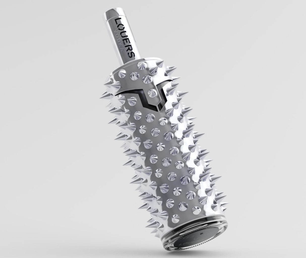
The bottle design was created from scratch, unfiltered by traditional industry constraints. The bottle needed to turn heads and command attention.
I also wanted to incorporate my Dutch heritage into the brand. For example the logo that you see is inspired by the contours of the face of the Dutch lion.
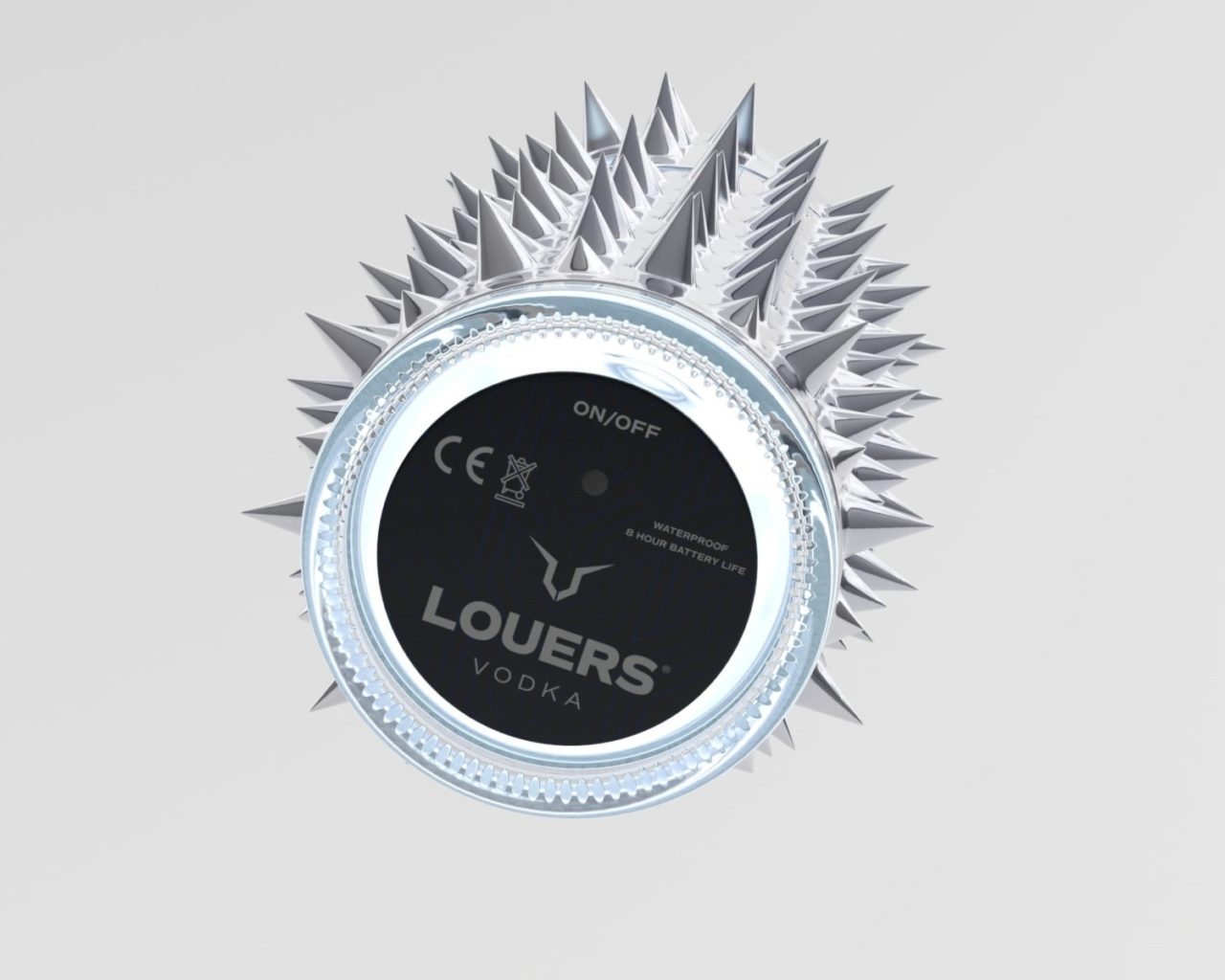
The bottle stands out during the day thanks to its sleek silver chrome design—but it’s at night that it truly comes alive, as the built-in LED illuminates the bottle’s most iconic branding elements.
What is innovative or unusual about your packaging?
We are also one of the first—if not the first—brands in the world to manufacture a spirits bottle in this way.
It’s unconventional, as it requires a significant amount of manual work during the assembly, bottling, and packaging process.
We’ve fused industrial materials with artisanal vodka to create a sensory statement: visual, tactile, and emotional.
What reactions have you had from customers?
People either love it or hate it—there aren’t many in between. And that’s exactly how we want it. We don’t need to be loved by everyone. If a design provokes emotion and gets people talking, then you’re holding something truly powerful in your hands.
Expanding into 35 countries within just three years of launch has given us more than enough feedback to go all-in and double down on global growth.
We also often get asked: “But how do you even hold the bottle?”
Our answer is simple—every luxury item comes with its so-called flaws. Take a Ferrari, for example. Every man wants one. It’s expensive, hard to get, uncomfortable to drive, and accelerates faster than most people can handle. But that’s exactly what makes it desirable. Remove those edges, and you remove the desire.
LOUERS is no different. It’s not made to blend in. It’s made to provoke, to challenge, and to be remembered.