Exclusive | Capturing Tasmania in Cape Hauy whisky packaging design
Cape Hauy is a whisky that conveys the unique character of Tasmania through its carefully crafted design. In this interview, Rowena Curlewis, Co-founder and CEO of Denomination, discusses how the island’s distinctive landscape served as the foundation for a packaging concept that is both elegant and authentic. Through the use of natural materials, refined forms and purposeful storytelling, the design achieves a balance of innovation and tradition that reflects the brand’s premium positioning.
Tell us a bit about the brand – its heritage, its story, and its markets.
Cape Hauy was created because our client, Jinding, felt there was an opportunity to bring to life the essence of Tasmania in a new whisky in a way that was distinctive to competitors in this market. Tasmanian whiskies, on the whole, tend to follow Scottish whiskies in their design: conservative, solid, reassuring through the use of traditional whisky cues. This was an opportunity to deviate from this and offer consumers a product and package that was unique, and that would also appeal to high end whisky connoisseurs in Australia and China. Our client’s brief was to create a brand that was premium, desirable, natural, contemporary and unique, and reflect its Tasmanian home. It had to also justify its super premium price point of $AUD400 and reflect its small batch nature: 1,000 units were produced for its inaugural release.
How does the design express the brand’s values? What inspired the design?
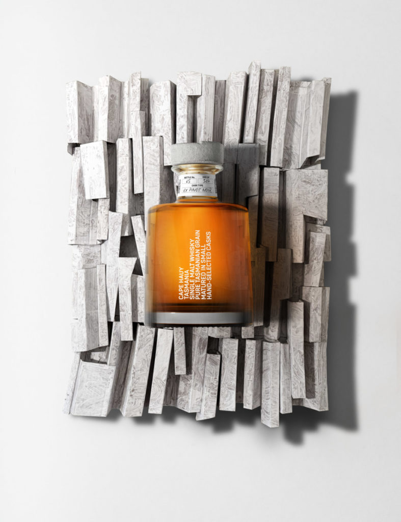
Our strategic positioning was centred on the wild Tasmanian landscape which would provide a sublime, rarefied experience for consumers that would be uniquely, intrinsically Tasmanian. The coastline of Tasmania is incredibly unique given the proliferation of dolerite. In fact, the largest surface exposure of dolerite in the world is found in Tasmania: 40% of the island’s landscape. One of the spectacular features of dolerite, is steep columnar cliffs and mountains. Dolerite has a huge influence on the soil which in turn influences the Tasmanian-grown grain which imparts a unique floral note.
The extraordinary and sculptural dolerite cliffs were our inspiration and resulted in a design which is disruptive, unique and highly memorable.
What is innovative or unusual about your packaging?
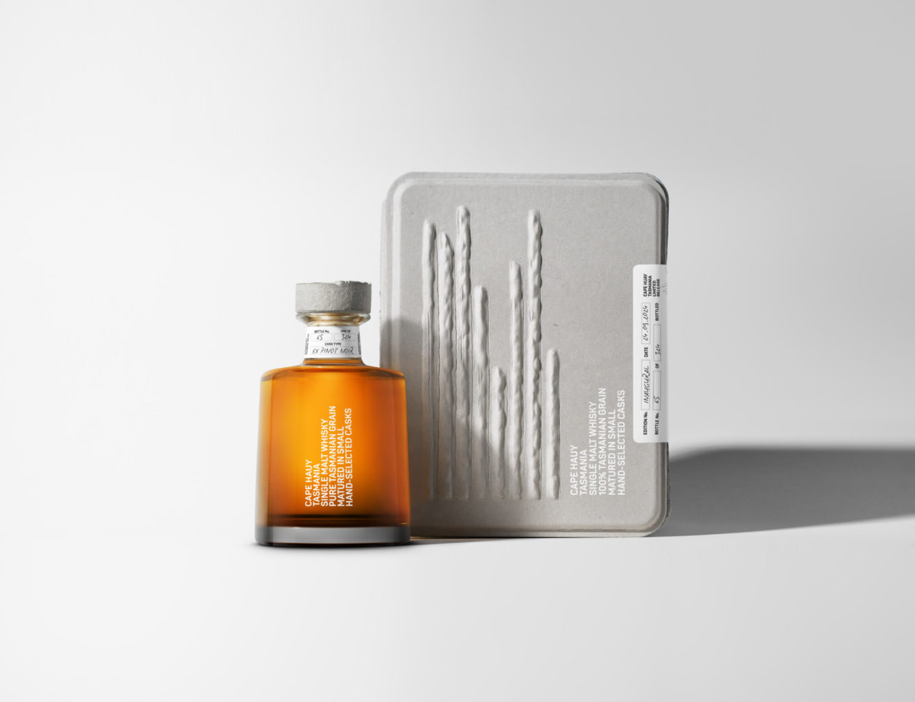
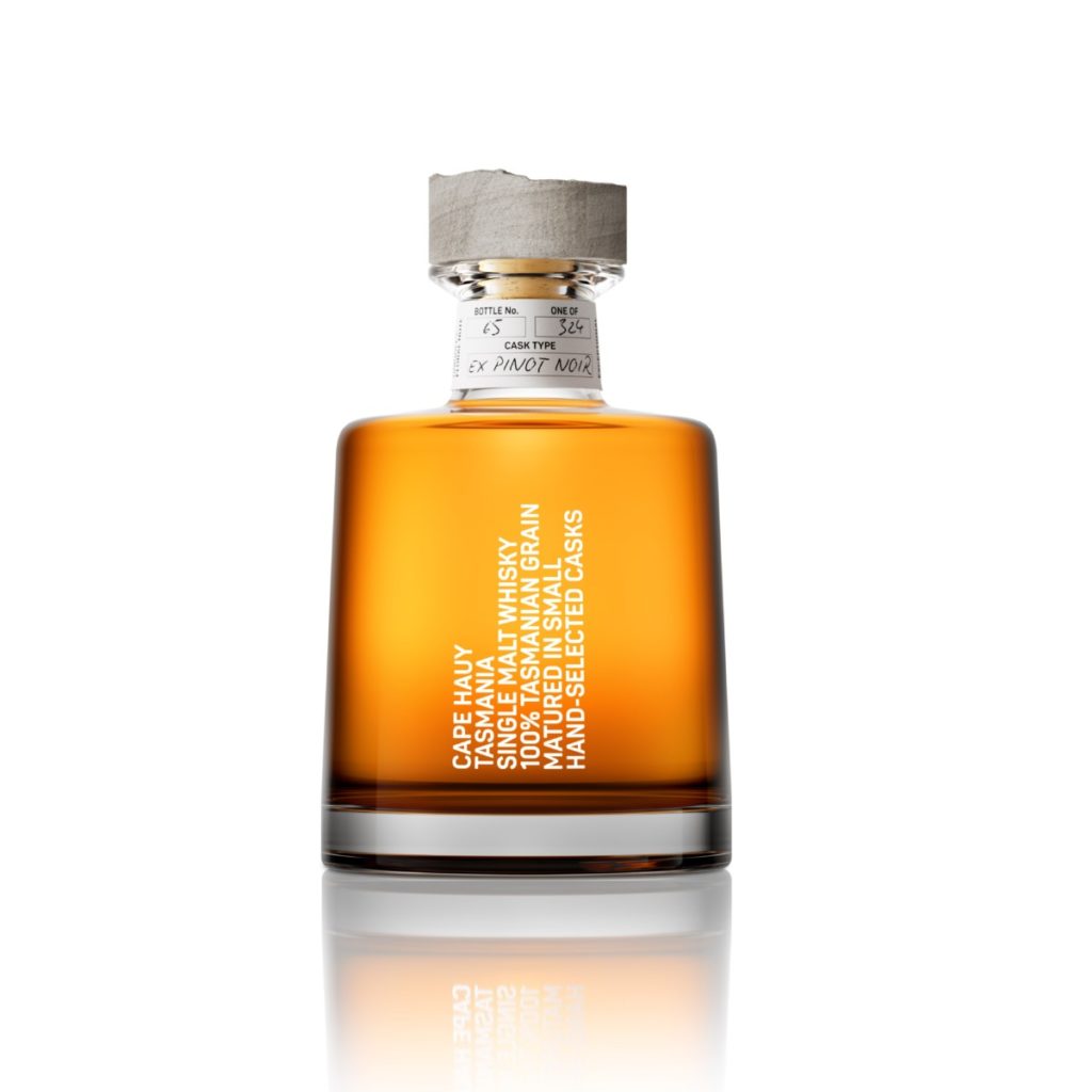
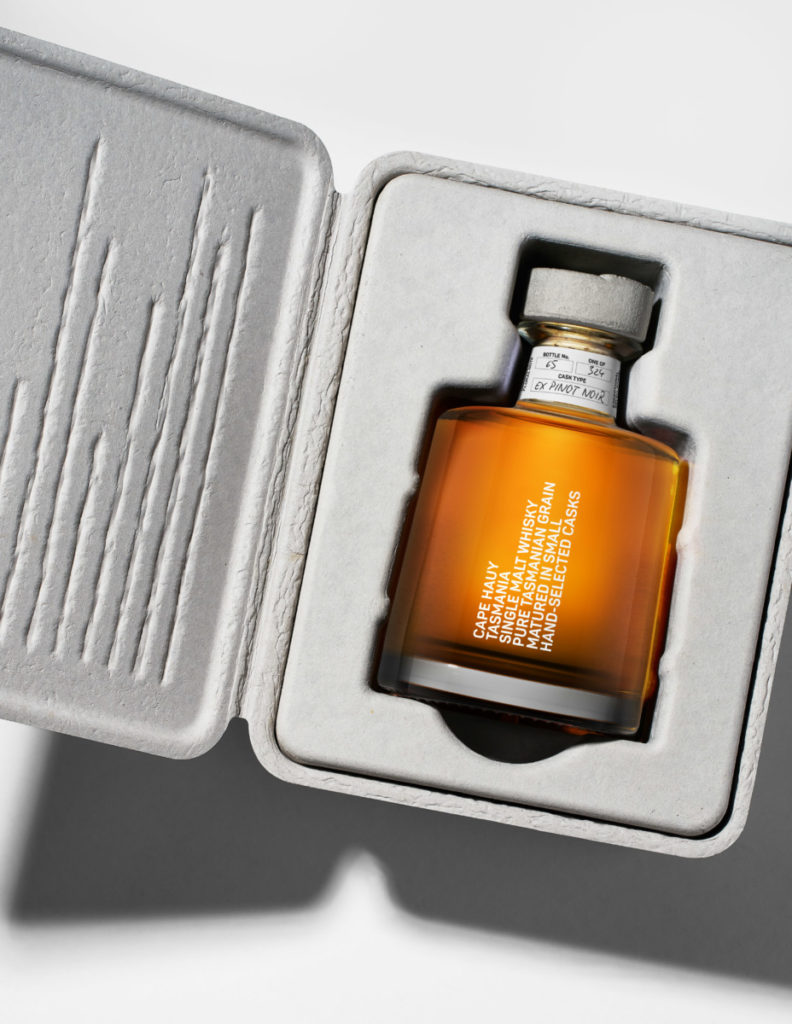
By incorporating semiotics of the Tasmanian landscape within the design, we have been able to create a design that is both authentic and bespoke. From the stopper made from reconstituted stone, to the grey textured 100% recycled pulp of the giftbox concepts, to the customised grey vignette on the bottle – each of these semiotically tie to the dolerite columns and Tasmanian landscape.
The typography stacked vertically to mirror the tall columnar cliffs and language spoke to the artisanal nature of the product. “Made by Tasmania” on the back speaks to the 100% Tasmanian ingredients and the influence of the landscape and terroir on the liquid.
The entire package is incredibly distinctive, innovative and memorable.
What technical challenges did you need to overcome to manufacture the packaging, if any?
Finding a supplier to produce the bespoke stopper was challenging. We approached ten suppliers around the world before we found one who would be prepared to push boundaries in order to create the exact colour, texture and weight of the stopper design. Our Head of Production, Anita Burrough, persevered in finding the perfect supplier for the stopper, and then ran a series of trials with them until the stopper was also perfect.
What reactions have you had from customers?
Our client, Jinding, is delighted with both the design and the response from customers, saying:
“Thank you Denomination! Cape Hauy wouldn’t have been possible without your creativity, expertise, and commitment to this project. We’re grateful for the partnership with you and can’t wait to see what else we can achieve together.”