Casal Mendes turns colour into the main ingredient of its summer identity
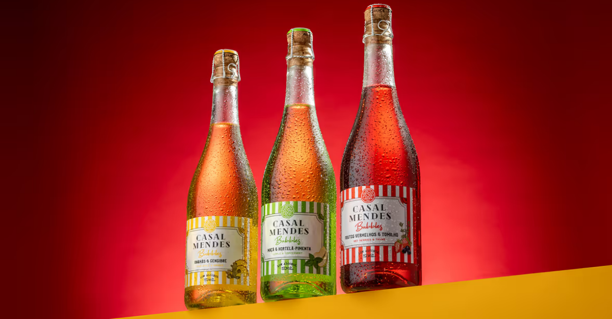
For Casal Mendes, the design team made colour the driving force behind the packaging, creating a bold and expressive visual language that communicates freshness, optimism and celebration while helping each flavour stand out on shelf and in social settings.
Inspired by spring energy, summer warmth and festival atmospheres, the project moves away from conventional wine packaging to create something more dynamic and contemporary. Each flavour now has its own personality, expressed through a specific colour palette and graphic treatment that makes the range feel cohesive while allowing individual bottles to stand confidently on their own.
Beyond the physical shelf, the packaging was also conceived to perform well in photographs and social media, where its strong colours and distinctive character help the brand stand out in shared moments. The result is a system built around colour, personality and connection, offering a fresh and vibrant expression of Casal Mendes for a new generation of consumers.