Exclusive | Folk and mysticism unite in Wanderwyld Primitivo’s striking packaging
At the intersection of storytelling, folklore, and artisanal craft, branding and packaging design agency Kingdom&Sparrow have created a captivating identity for Wanderwyld Primitivo, a bold wine brand rooted in the rich heritage of North Macedonia.
Based in Cornwall, Kingdom&Sparrow specialise in food, drink, and lifestyle brands, combining traditional artistry with contemporary design to bring stories to life on every label. Recently ranked second globally in the 2025 World Brand Design Society (WBDS) rankings, the agency has an impressive portfolio spanning continents, from Australian honey to Polynesian rum.
In this interview we explored Kingdom&Sparrow’s inspiration and creative process behind the Wanderwyld packaging, a striking wood-cut design that channels folklore and mysticism to celebrate the rediscovered Primitivo grape, inviting consumers on a journey through history and nature with every bottle.
Tell us a bit about the brand – its heritage, its story, and its markets.
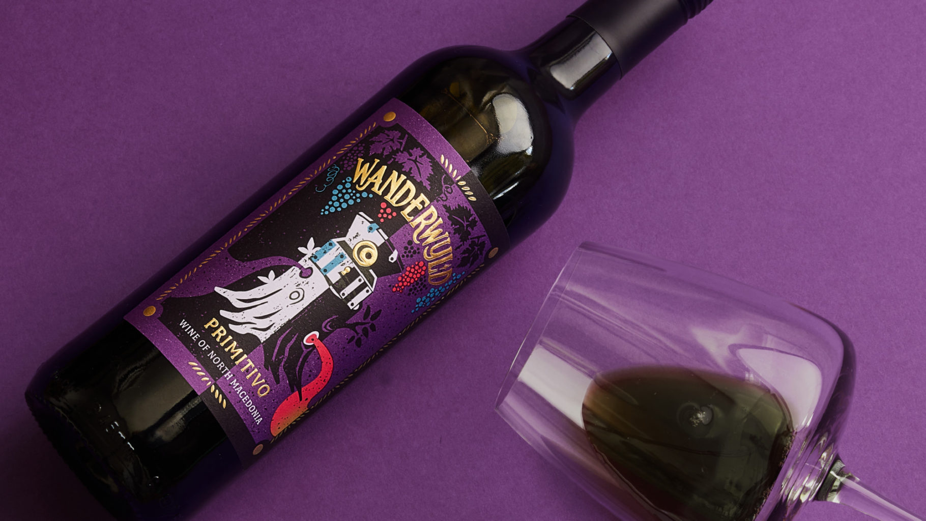
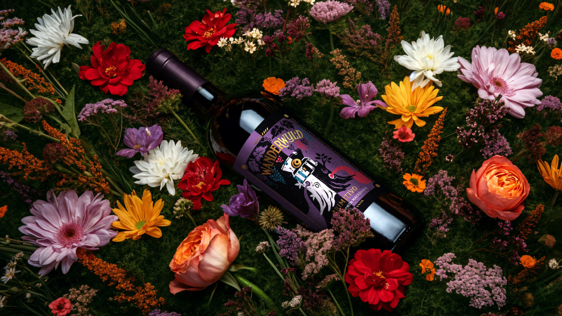
The Wanderwyld brand is rooted in storytelling, folklore and the rich histories of the wine’s regions, starting with the launch of the Wanderwyld Primitivo from North Macedonia. It’s a bold, full-bodied wine and when it came to designing the bottle label, the primary goal was to create a distinctive and intriguing composition that would stand out on the supermarket shelves.
How does the design express the brand’s values? What inspired the design?
For centuries the true origin of the Primitivo grape has been shrouded in mystery; this wandering grape is believed to have originated in nearby Croatia, traveling to the heart of Macedonia in the 16th century where it became known locally as Kratosija, and then onto Italy. Over time the ancient grape teetered on the brink of extinction, but over time Macedonian winemakers have nurtured these vines, the varietal now thriving once more. We wanted the label’s colour palette to reflect the deep velvety hues of dark fruits, juicy plums and warming spices.
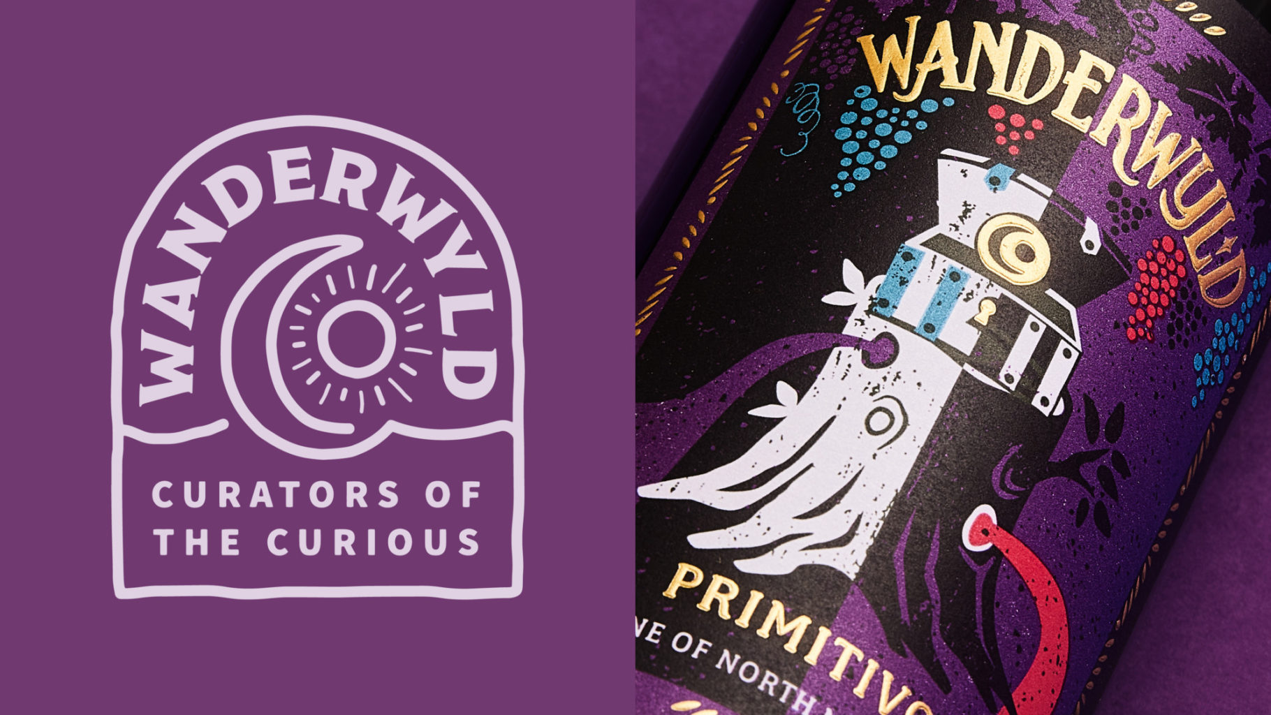
Inspired by tarot card designs, the illustration has a surreal, mystical and earthy quality, evoking folklore stories. Discoverable elements within the label arouse curiosity and take you on a journey through the forest. The tree stump draws on folkloric tales and the natural world, reinforcing the brand’s rich storytelling ethos, whilst the treasure chest symbolises the once-lost Kratosija grape – now rediscovered and preserved.
What is innovative or unusual about your packaging?
The exciting thing about Wanderwyld is that it brings the world of folk art into wine in a bold and contemporary way, shaking up what is usually a traditional category.
We love a hand-crafted approach to design, so chose to create a wood-cut illustration style that lends itself to a folk-art aesthetic, while gold foil detailing adds a premium and magical finish. The textured effect further enhances the artisanal feel of the design.
What reactions have you had from customers?
The label has been really well received and once launched, went straight onto the shelves of selected Waitrose stores earlier this year.