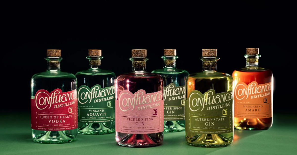
Confluence Distilling asserts its artisanal identity with elegance
Confluence Distilling’s meticulous design proudly reflects its artisan roots and strong local roots.
Confluence Distilling proudly asserts its roots in every detail. The squat bottle, cork stopper and cut-out label reflect the authenticity of the distillery and its bar. The hand-written logo follows the curves of the name and bottle, creating a visual harmony full of character. Conceived by Best Studio, the design avoids artifice to better capture attention, focusing on coherence, legibility and discreet elegance. The whole embodies a strong identity, rooted in authenticity and modern craftsmanship.