Focus on…Our Favourite packs from January
Let’s have a look at some of our favourite packs from January! These designs and packs are all thanks to the brands and designers and their outstanding work.
With packaging designed by Serious Studio, Kasama is a rum brand inspired by the vibrance of the tropics and the celebration of good company.
Stamps and hand-drawn illustrations were meticulously applied to Kasama’s bottle to pay homage to the rum’s roots and evoke a sense of fun. This extended to its box as well, where the flora and foliage were mixed with postage stamps to make it appear like a package from the Philippines.
According to the company, “The brand’s packaging became a product experience in itself, projecting a sense of confidence and ceremonial decoration in contrast to what you’d typically expect of rum”.

Bodegas Jaime is a family-owned winery located in Zaragoza – Spain. It produces Turmeon, a Classic Spanish Vermouth with a recipe that has been passed down from generation to generation, since 1846.
Turmeon is a vermouth macerated with twelve aphrodisiac botanicals used since the Middle Ages to make the famous ‘Love Potions’. This idea was conveyed using vintage yet surprising colour combinations to create vibrancy while evoking an emotional connection with the consumers. According to the designers, “It was important to ensure that the new design looked premium, yet approachable and inviting to the consumer”.
The colourful patterns, intricate detailing, and foils, portray the fun side of the brand while still conveying premiumness and the detailed care that goes into the product itself.

Hyper skin is a clinical skincare brand hyper-focused on formulas that treat the unique needs of skin of colour.
The new branding features an energetic logo that matches the brand name, as well as minimal packaging that conveys the brand’s message well.
To stand out from other products, the hero product – a Vitamin C Serum, was given a new look and bigger size to go along with the rebrand.
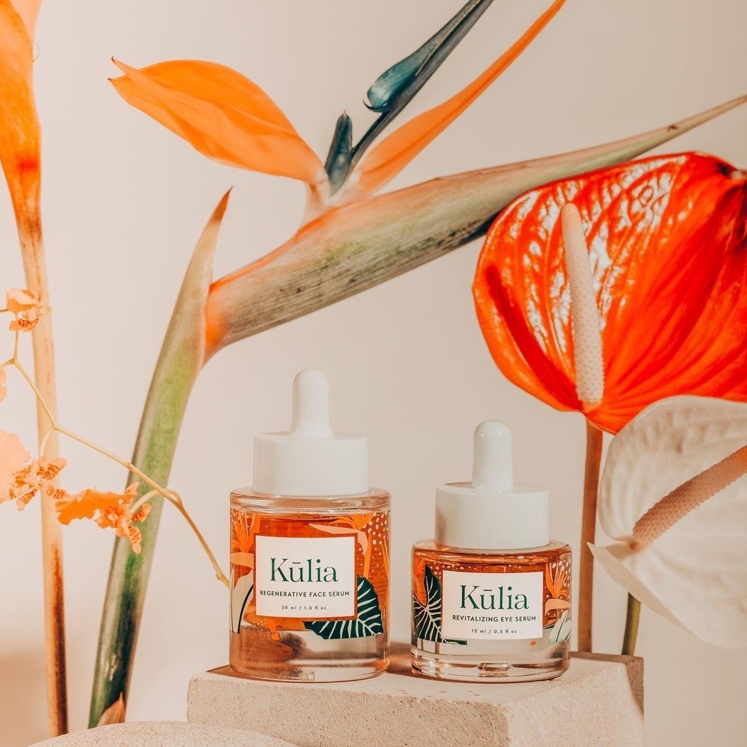
Design Sake Studio has created an identity for Kulia, a luxury skincare brand committed to improving organic skincare.
According to the designers, “We discarded using neutral colour schemes and foil finishes that saturate the clean beauty space and swapped them for custom floral illustrations inspired by the Hawaiian Islands”.
Intricate details cover the exterior packaging to then reveal a 5-color silkscreened bottle decorated with lush leaves and birds of paradise, taking consumers to a destination every time they interact with Kūlia products; one that feels natural, organic, and wild grown.


