Exclusive | Designing beauty to be carried: the story behind GLOWA
In this interview, we speak with Creavora Studio, the Indonesian creative agency behind the packaging for GLOWA. The studio shares its creative journey behind a skincare brand designed to bring a fresh perspective to how beauty products are carried, held, and experienced.
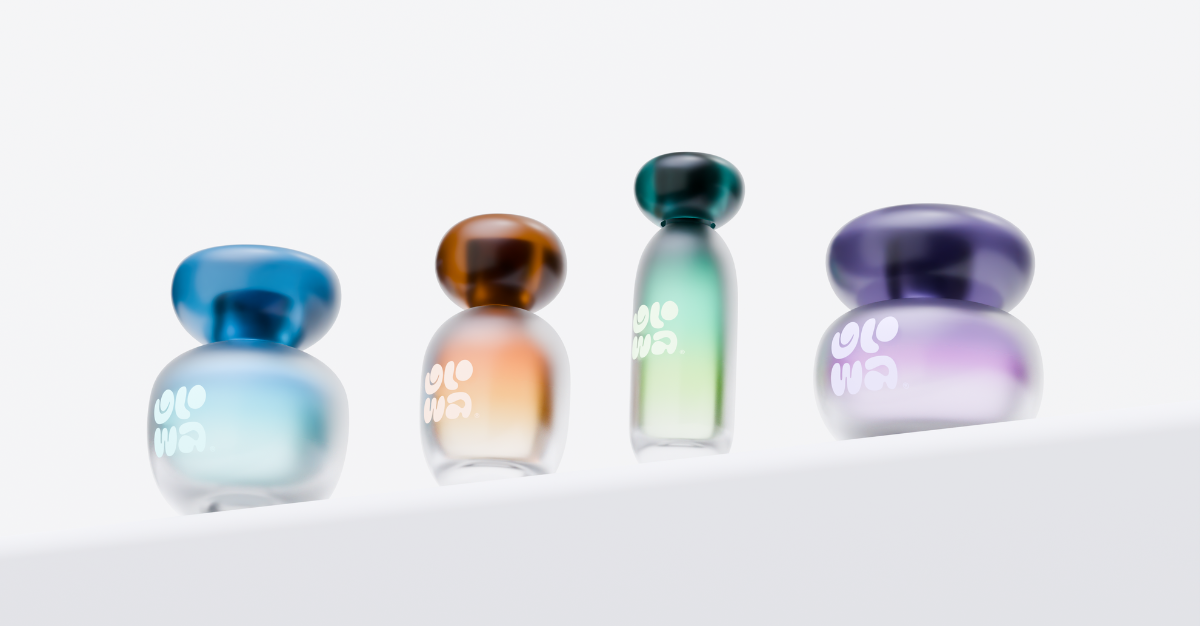
GLOWA takes inspiration from the idea of skincare that travels with you, moving beyond the traditional bathroom shelf to create something more personal and portable. With its distinctive forms and considered visual identity, the brand brings a playful yet refined perspective to the beauty category.
From the thinking behind its recognisable pebble-shaped packaging to the details that make the experience feel so tactile, Creavora Studio reveals how GLOWA came to life and what it takes to create packaging that people genuinely want to keep close.
Can you tell us more about Creavora Studio, your role, and the studio’s approach to design?
We’re Creavora Studio, an independent creative agency based in Banda Aceh, Indonesia. We focus on brand identity, packaging & bottle design, and 3D visualization, and we’ve worked with clients both locally and abroad. I’m Martunis, the founder & design lead here, so my day to day is a mix of creative direction and getting hands on with the actual design work.
Our approach is clean and minimal, but we try not to let minimalism become the whole point. We always start by asking what a brand should feel like once it’s actually in someone’s hands, not just how it should look on a screen.
What do you feel is most unusual or innovative about the packaging?
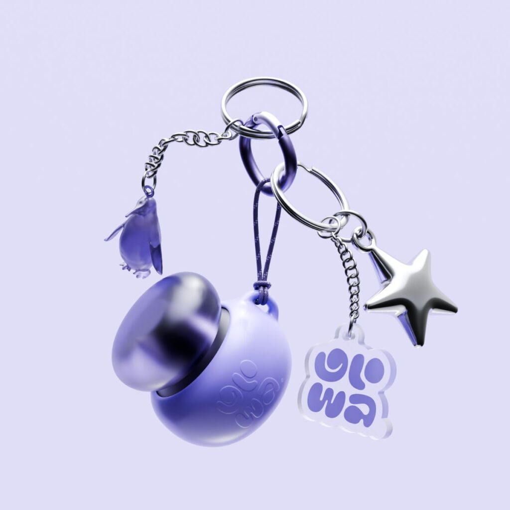
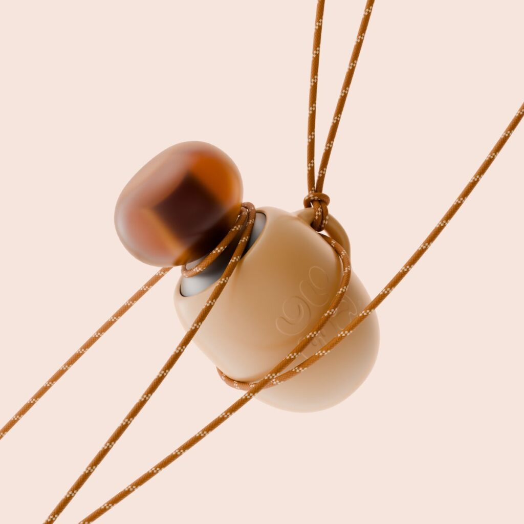
The whole idea behind GLOWA was skincare that travels with you. Instead of another bottle sitting on a bathroom shelf, we wanted beauty to feel like something you’d actually want to carry around, almost like a personal gadget.
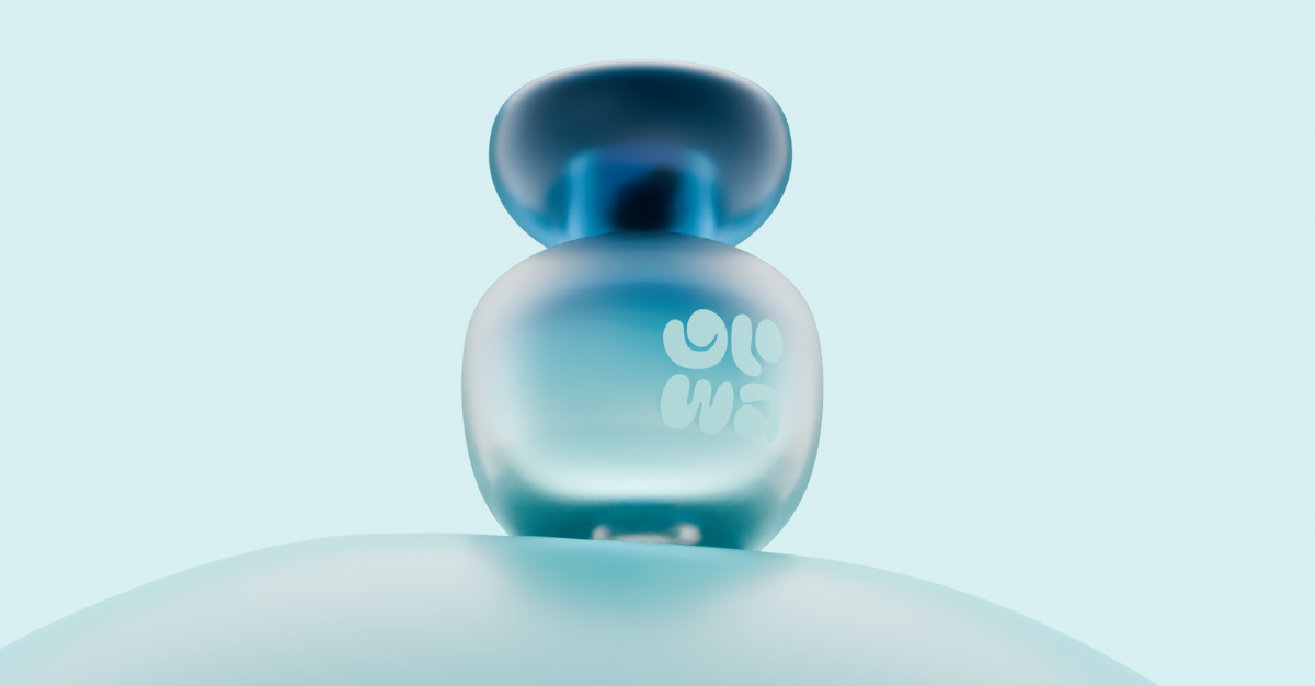
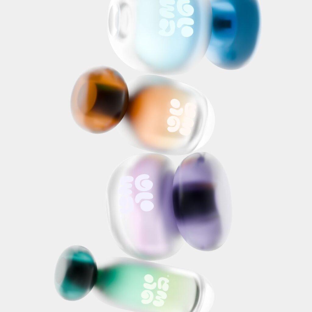
That’s where the pebble shapes came from. They’re rounded, tactile, and honestly just nice to hold, which softens a category that can feel pretty clinical. The logo embossed works the same way, it’s meant to be felt with your fingers as much as read with your eyes. We also skipped illustrations completely and let the muted/gradient pastels and translucent jewel tone caps carry the mood of hydration and light on their own.
Were there any challenges during the creative process, whether strategic, visual, or technical, and how did you approach them?
Honestly the hardest part was standing out. Pastel and minimal is basically the default look in skincare right now, so it’s easy to make something pretty that still blends in. We got around that by grounding everything in one behavioral idea, portability, so every choice actually had a reason behind it instead of just looking nice.
On the technical side, getting the pebble forms to feel organic without looking sloppy took a lot of back and forth, same with keeping the embossed logo legible at small sizes without making it too loud. We also built out a short motion piece alongside the static packaging system, which added its own layer of decisions around how the forms should move.
From your perspective, what role does packaging play in building trust and loyalty in self-care or wellness brands?
Packaging is usually the first real, physical thing someone experiences from a brand, way before they ever try the product itself. How it feels in your hand, how it opens, how it sits on a shelf, all of that shapes trust before a single drop touches your skin.
Loyalty comes after that, once things feel consistent and honest rather than overhyped. People notice when packaging tries too hard. When something feels calm and considered instead, it earns a kind of quiet trust, and that’s usually what turns a one time purchase into an actual habit.
How has the feedback been so far, from the client, consumers, or even the design community?
Really encouraging so far. GLOWA got featured on both DIELINE and Abduzeedo, and on Behance it’s crossed 12,000 views and over 1,200 appreciations, with a lot of thoughtful comments from other designers. It’s been nice seeing people respond specifically to the “wearable beauty” idea, that’s exactly the part we hoped would land.